![]()
In this blog post our partner Mario Bastande, Data Officer at Action Against Hunger (ACF) explains how he used graph technology to improve the deployment of humanitarian projects.
Action Against Hunger is a global humanitarian organization created in 1979, committed to ending world hunger. The organization helps malnourished children while providing communities with access to safe water and sustainable solutions to hunger.
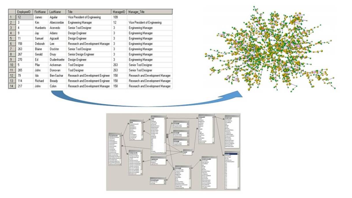
As Non-Governmental Organizations (NGOs) gather more and more information about projects, people, and crisis, the key element for them is now to draw on the connections within the data collected to uncover trends, correlations, and support projects.
Unfortunately for NGOs like Action Against Hunger, unstructured data and tabular technology often prevent experts to exploit data in a proper way.
Action Against Hunger had already set up a quantitative approach to find solutions and improve their actions but missed the qualitative and contextual insights. That’s why we came up with the idea of using graph technology. It would help us complement the IT Department and Data Unit efforts to support some significant projects within the organization.
More and more large companies are leveraging graph technology in decision-making models. NGOs as Action Against Hunger are now making their attempts at using these tools to extract insights from their connected data. The goal of using what we call “Graphs for good at Action Against Hunger” is to be more efficient and transparent, and this can have a crucial impact on people’s lives.
Graph technology could help answer several questions that would benefit the organization. For instance: is there common behavior factors between different projects? Can elements of different resources or projects be related? For example, security incidents in a city could influence the way other projects run in there.
There are several factors why we decided to choose graph technology over the classic relational or tabular approach:
- Agility in working with relationships
- Ability to model qualitative data instead of quantitative
- Flexibility to change the model while adding more variables during the process
- Accessibility to non-expert end users
- Capability to exploit simple and efficient query languages, such as Cypher
To start with, we choose one of the best-suited datasets within the organization, a small well-structured dataset compiling humanitarian money transfers. The data is from a project called Kit For Autonomous Cash Transfer in Humanitarian Emergencies (KACHE) which goal is to deploy electronic cash transfers in emergency situations when no suitable infrastructure is available. It also offers Action Against Hunger the opportunity to track transactions in order to better recognize crisis-affected population behaviors as well as most required items for every place.
The data model of our dataset contains the crucial labels for the research: Person, Vendor or Transaction for the most relevant ones. And the dataset covers the activity within two countries where Action Against Hunger works, Lebanon and Mali, creating around 112 thousand nodes and 448 thousand relationships.
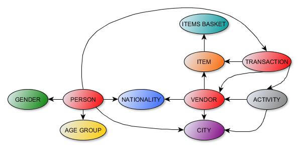
One of the most important things when modeling the data was to have reusable labels for other projects, in such a way that we could cross the data by using common features as Nationality, Gender, Age Group, City or Activity (corresponding to donors) with other developments. Thus, we will have the occasion to extend this model to a broader one, adding and linking more projects’ data.
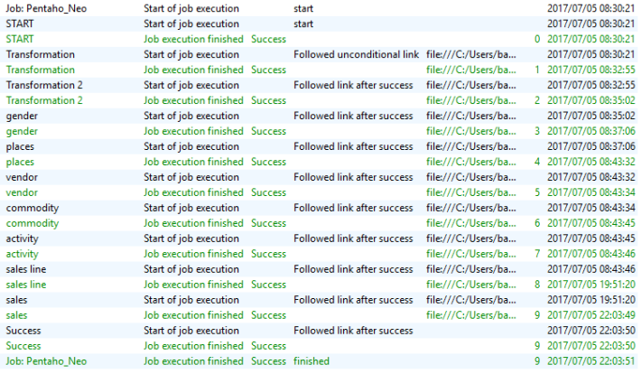
Because the IT department in Action Against Hunger has always used the relational Database SQL Server to store the data, we had to adapt. After figuring the data model, we could do the transformation using Pentaho Kettle, an Extraction Transformation Load (ETL) tool.
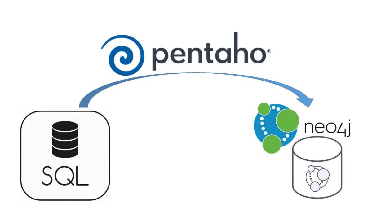
The data goes from the Data Warehouse (DW) as the source in SQL Server, through Pentaho, and once all the jobs and transformations are finished, it reaches Neo4j. Due to the nature of the data structure in the DW, the migration is quite costly right now (about 13 hours), but we are working on optimizing the Pentaho jobs code.
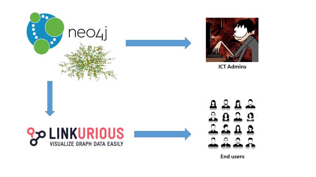
Although this instance was initially built to serve IT administrators purposes, the IT department always had in mind (inspired by the Panama Papers) how final users, such as data owners, could work with their data. The problem here was that end users have no knowledge about how data is stored or transformed. This is where Linkurious came up.
Linkurious graph analysis and visualization software offers a chance to understand, explore, analyze and report connected data and its relations in an easier way for non-technical users. Linkurious Enterprise supports Neo4j and indexes multiple data sources in a simple and automatic way.
Linkurious has always cooperated and helped Action Against Hunger make this happen, offering a really appreciated software and support to our NGO. Overall we had an outstanding experience working together with the Linkurious team.
The ability to add and edit data in real-time offers several benefits to Action Against Hunger’s users:
- Rethink the way data is stored in the organization
- Increase users data education and understanding
- Avoid time-consuming and error-prone approaches like Excel to gather and represent data
Once we connected our Neo4j instance to Linkurious, we were able to start looking for answers.
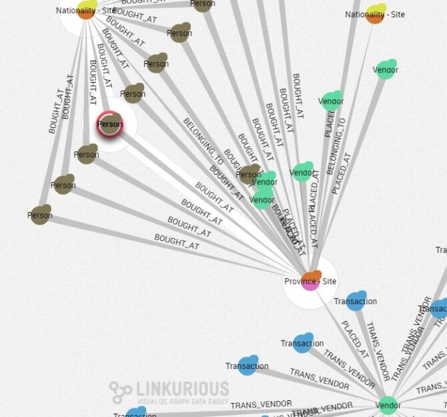
Let’s start with a simple example, coming from the question “How do people relate to each other depending on the site where the transaction takes place?” The answers can help understand the big picture of what occurs among affected people and local sellers. All those people belong to the same environment, and analysts can get key insights from those relationships, such as the cultural or behavioral roles.
In the example below, you see part of the graph data: affected people (brown nodes), vendors (green nodes) and their transactions (blue nodes), nationalities (yellow/orange nodes), etc. Vendor’s transactions are indirectly related to other people through the province they live in. Those visualizations can additionally help understand how sales are organized for a given province among people.
In the screenshot below, we look at different persons (purple nodes) and transactions (yellow nodes) happening the same day, providing information about flows of people (pink nodes) going to buy at the same time.
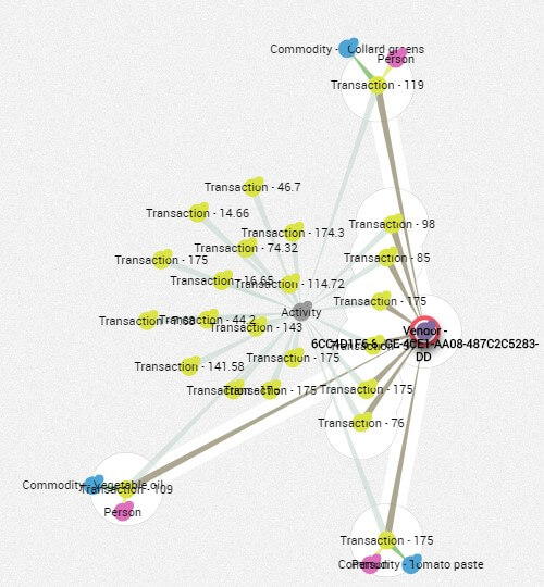
This information is valuable because we can guess that those people potentially know each other, meaning we can group them into different sectors, communities or social networks. Data explains when, how, or where they buy, and how people’s nationality/culture influences their behaviors, helping for analysis and forecasting.
We have taken higher advantage than expected of analytics, such as the shortest path between two nodes. We were actually surprised by the power of the Dijkstra algorithm, together with other methods to get not only the shortest but the most suitable path. We believe that improvements in these algorithms (like flows, graph analytics, influences) could really make the difference, in terms of discovering patterns and better understanding the data relations.
For instance, we were interested in how a particular item – blossom water – was sold in a place. Using the shortest path feature, we can understand that there is no direct path linking both nodes (item and place), which means it was never sold in that place. Thanks to the connections among nodes in the network, the algorithm is also able to find some other, indirect, optimized paths between them, letting us explore the needed steps to provide that item in there.
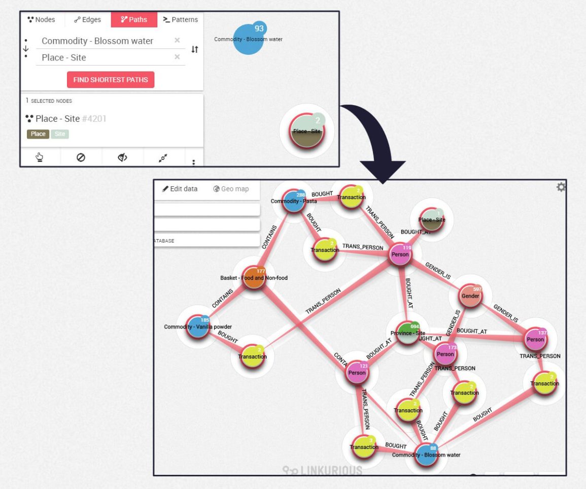
Indirect connections could help recommend to a person, how she/he could get the goods by connecting her/him with other people nearby who bought the desired item. At the same time, if the person cannot directly get that article, he/she can still obtain related items. Indeed, all blue nodes are part of a basket (orange nodes) that are somehow similar.
The blocking pattern is maybe the most interesting one. It reveals that some people (vendors or even affected persons) may be blocking certain items based on localization or wholesale purchases.
In humanitarian actions, there is always a big issue regarding access, either for an organization to access affected places or for affected populations to access emergency goods. With graph visualization and analysis, we open a new window of opportunity to understand who (people, organizations, or providers) has access to certain goods, as well as through whom we can get that transaction done.
How do people move during natural disasters or armed conflict situations is also one of the most crucial questions for humanitarian organizations. Thanks to Linkurious, it is possible to follow those movements. Although KACHE’s localization dataset is not the greatest one, we can represent transactions based on where people completed them (nodes are blurred for privacy reasons).
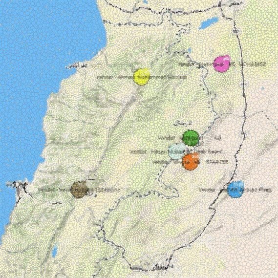
Geolocation of graph data allows answering relevant and interesting questions for data owners such as: are the vendors fixed or mobile? Do all the workers belong to the same shop?
Graph analysis and visualization allow to finally define how cash flows through the network, making it possible to look for common patterns and specific entity information.
Now that Action Against Hunger understands how to leverage information coming from graphs, it opens plenty of options to apply and implement graphs in the organization.
The main objective is to cross data from different projects to find relationships within data to answer more general questions such as how workers are related? Are the communications a success key for a project? Why are some donor proposals successful and others not? Are corruption and fraud present within the organization? Once we add more components to our graph, we will be able to analyze projects’ impact and compare real people`s profiles with donors’ programmed goals.
The plan is to integrate Linkurious technology internally as a publication and management tool, which is theoretically possible as Linkurious team informed us, in order to apply their features together with our Business Intelligence dashboards.
Today, our main objective is to reveal the sometimes not-obvious relationships among entities, departments, or persons within the organization, to get something essential for an NGO: more efficiency and more transparency.

About the author:
Mario Bastande has a background in Mathematical Engineering, specialized in Humanitarian Action optimization and technical research. After his experience in the private sector, he realized the power of technology to make a real impact on people’s life. With experience in the field, he mixes both pieces of knowledge to improve accountability, monitoring, and effectiveness. Graph technology has been crucial on his last developments in NGOs.
A spotlight on graph technology directly in your inbox.