Graph visualization can be used to understand how an organization works. It reveals the connections between people, the flow of information that makes an organization tick.
We talked in the past about interesting approaches to organizational network analysis but it’s rare to find real life datasets. The exception being the Enron mail communications which are available as a result of the fraud investigation the company was involved in.
That’s why we were excited to stumble upon a real-life dataset recently through Micah Stubbs. The complete City of Houston employee organizational data is available online as an Excel spreadsheet. It was easy to load it up in a Neo4j graph database:
You can download the data in a Neo4j format here.
The data contains information about 11 032 employees, their hierarchical relationships and their 24 departments. As anybody who has worked in a company for more than 5 minutes know, hierarchical relationships are just one the many types of relationships that exist in a company.
With Linkurious, we can explore the Houston’s hierarchy. If I type the name of Houston’s mayor, Annise Parker, I can view her relationships:
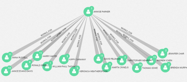
It’s easy to explore interactively and identify the Mayor’s 2nd degree connections:
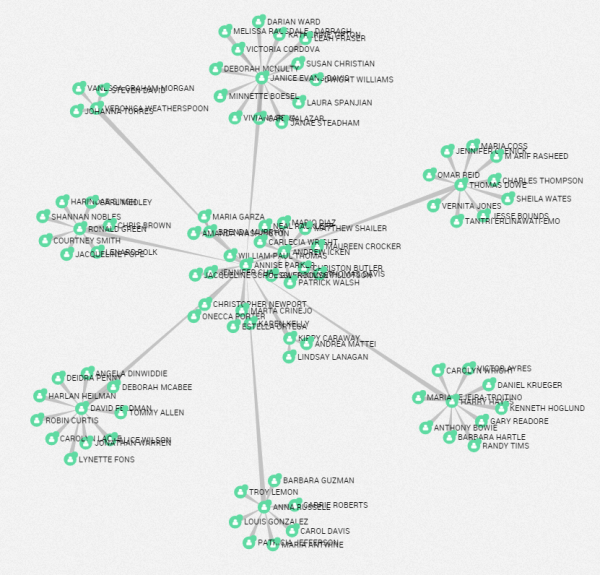
If we zoom in, we can identify a small group of employees reporting directly to the Mayor and with few direct reports:
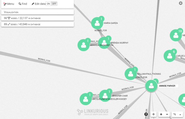
William-Paul Thomas, Brenda Murphy or Jennifer Char work directly for the mayor but are not surrounded by a large staff. Graph visualization can help us identify that of anomalous pattern quickly.
It’s also possible with Linkurious to analyse data to surface unexpected insights. Through Cypher, Neo4j’s query language I can identify advanced patterns. For example, I can find the longest chain of command within the organization with this query:
//———————–
//Longest chain of command
//———————–
MATCH p=a<-[:WORKS_FOR*]-b
RETURN p
ORDER BY length(p) desc
LIMIT 1
It appears Nicholas Franklin (an employee of the city of Houston) and Annise Parker (mayor of Houston) are separated by 10 levels of hierarchies. The result is immediately visualized in Linkurious:
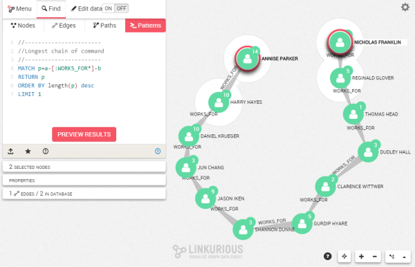
I can also identify the person who has the most direct reports:
//———————–
//Employee with the highest number of direct report
//———————–
MATCH (a:EMPLOYEE)<-[r:WORKS_FOR]-(b:EMPLOYEE)
WITH a, count(b) as reports
RETURN a
ORDER BY reports DESC
LIMIT 1
Here is the most “overworked” city employee in Houston:
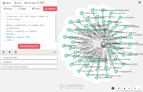
Once again, Linkurious allows me to visualize the result of the query.
If you want to explore a real-life company hierarchy, download Houston’s employee data and play with it! You can also try Linkurious and discover how to understand the connections in your data.
A spotlight on graph technology directly in your inbox.
