In this blog post, Ralf Becher, Qlik Luminary and Principal BI/Big Data Consultant from our partner TIQ Solutions, explains how he developed a graph extension in Qlik Sense with the Ogma graph visualization library to provide new analytics insights.
Qlik Sense is a modern web based self service analytics platform. With its powerful in-memory indexing engine (QIX) it provides an associative model to explore, search and analyze data. I have been working with Qlik products for more than ten years and always looked for a way to integrate graph data and graph visualizations to extend the classic relational or tabular context.
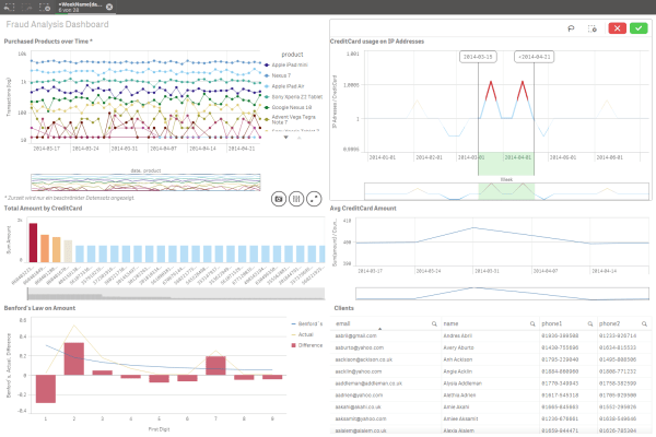
Exploring data as a graph and using graph algorithms in analytics opens up a lot of more use cases to gain more insights from relations and hidden patterns inside the data. Combining both relational and graph data analytics under one hood seems to be a promising goal. I started in 2011 to integrate graph data from Neo4j into QlikView and since then I developed a couple of extensions (custom web based visualization components) for QlikView and Qlik Sense using several graph visualization libraries (d3.js, graphdracula.js, sigma.js, alchemy.js, vis.js).
Linkurious’ product had attracted me for a while because of its feature richness and appealing graph layout and interactivity. The integration of the whole product into Qlik was a first idea but probably too complex. With the release of Ogma library, the graph visualization component of Linkurious, this seemed to makes more sense now.
The integration of Ogma was straight forward. I could use an existing Qlik Sense extension I developed with vis.js network diagram and I only needed to add the library calls and to reshape the existing graph data model of nodes and edges because of the different object properties. Also, the good online documentation and examples of Ogma usage helped me a lot to recreate the same functionality quickly. After that, I added more Ogma features I discovered during the implementation like node filters and lasso selection to extend the functionality. During the whole implementation process I faced a few issues I could address to the support and those issues were fixed and delivered in the next version. Also questions about the usage could be answered quickly. Overall I had an excellent experience working together with the Linkurious team!
The implementation of my graph visualization extension is more or less generic and doesn’t target a specific use case. However, for testing and demonstration I used a data set from purchases of an online shop. Out of the records of the transaction table I created a graph of the interesting data points to visualize how transactions are linked together. This can help to discover hidden patterns like fraudulent behavior or fraud rings.
A graph can be stored as an adjacency list in the Qlik data model. Each record in the adjacency list contains one edge of the graph. In this use case I pulled out the relations of data points of the transaction table as source → target relations. For Qlik’s selection purpose I tied the edge to the original transaction by the field . So I can indirectly select a transaction id when a selection is made on a node.
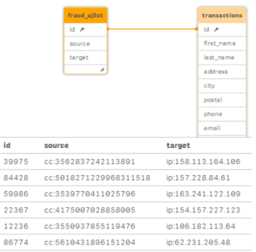
Since the source and target nodes stored inside of the adjacency list table can have multiple types I used a prefixing to keep the type information (cc: for credit card, ip: for IP address etc.). The type is later used in the graph visualization to determine icon and color of a node.
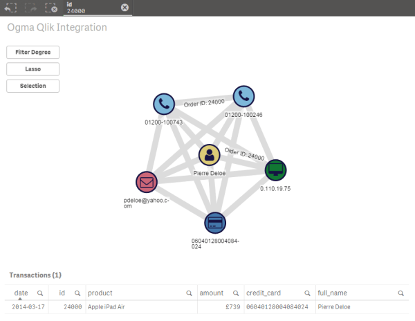
Now we can select most important data points in Qlik Sense to limit the graph of interconnected transactions to a handy size for further exploration. We can use any Qlik Sense UI component to process a selection. In this case I can use a bar chart which aggregates most used credit cards as an entry point.
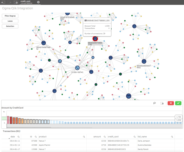
The resulting graph tells us a couple of things:
- transactions are interconnected;
- nodes are colored by node type (credit card, phone number, ip address etc.) and use an icon and hover popup to give us a contextual information;
- edges thickness represents the order amount;
- node size represents the node’s degree, a measure of connectedness;
- high degree nodes are hot spots to consider for further investigation.
Ogma provides us a couple of features to do some more interactions on the graph. I have just implemented a few for this use case:
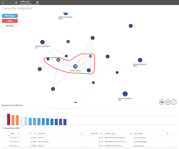
- node filter: gives the ability to filter out unimportant nodes, in this case we can filter out nodes with a low degree (could be aggregated amount too)
- lasso selection on nodes: select the nodes of most interest and the linked transactions for further investigation
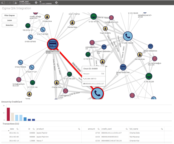
Now we have a generic graph extension in Qlik Sense using Ogma which provides graph visualization, navigation, filtering and selection. This is a good starting point to build use case oriented and customized graph based solutions in Qlik Sense. We can add more features from Ogma library or use different graph layouts to meet clients requirements. Finally, it gives us the ability to create more valuable insights in analytics projects.
Data visualization and analysis tools are essential to quickly focus and leverage the relevant insights in your data. Solutions like Qlik Sense allows enterprises to build interactive visualizations, explore and analyze data to make meaningful decisions. However the traditional tabular approach can fail to efficiently analyze highly connected data.
The combination of traditional data visualization and analysis tools with graph technologies offer new essential analytics insights. It becomes easier to leverage the essential information that lies within the connections of the data when exploring it as a graph. From financial monitoring to business intelligence, you can reinforce your analytics capacities with this graph extension for Qlik Sense.
Contact Ralf Becher and TIQ Solutions for more information.
A spotlight on graph technology directly in your inbox.
