Graph Viz 101 is a series of posts to teach the basics of graph visualization, written by Sébastien Heymann in collaboration with Bénédicte Le Grand of Université de Paris 1. This is our third post, please discuss it below!
In this blog post we provide a short introduction to the most common ways to represent graphs: matrices and node-link diagrams.
What makes graph data particular is the key importance of relationships. Observing and navigating in this context calls for the development of suitable visualization and interaction techniques in conjunction with storage and data mining solutions. Graphs have therefore received a large attention from Information Visualization researchers, which has led to multiple methods and techniques for their representation and exploration. Usually, representations of graphs are projections of the topology on two or three dimensional spaces using algorithms that calculate nodes coordinates. These algorithms are called layouts. We present here two classical representations: matrix-based representations, and representations with dots and lines on which we will more specifically focus in GraphViz 101.

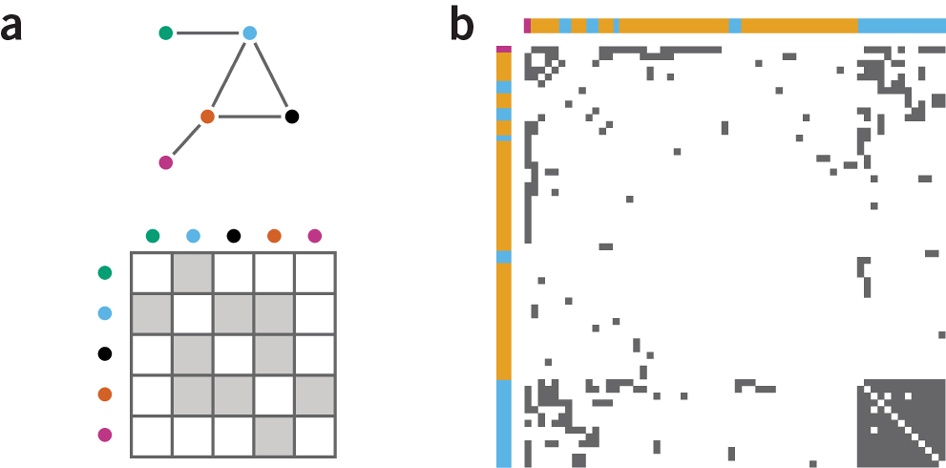
Introduced in (Bertin 1967), matrix-based representations rely on the adjacency matrix, i.e. a Boolean matrix whose rows and columns represent the nodes of the graph. For each link between two nodes, the cell at the intersection of the corresponding row and column contains the value “true”. Otherwise, it is set to “false”. It is possible to replace the Boolean values by those links’ attributes to add more information to the representation.
Matrix-based representations can be “reordered” through successive permutations of its rows and columns to reveal interesting patterns in the graph structure. One of the main advantages of this representation is to avoid occlusion problems encountered using the representation with dots and lines, which we will see in the following post. Matrices are efficient to perform basic tasks like identifying the most connected node, a link between two nodes, or a common neighbor of two nodes. However they perform poorly on more complex tasks such as finding a path between two nodes, even in small matrices (Ghoniem 2004). Such drawbacks may be the reason why they remain underused compared to representations with dots and lines.

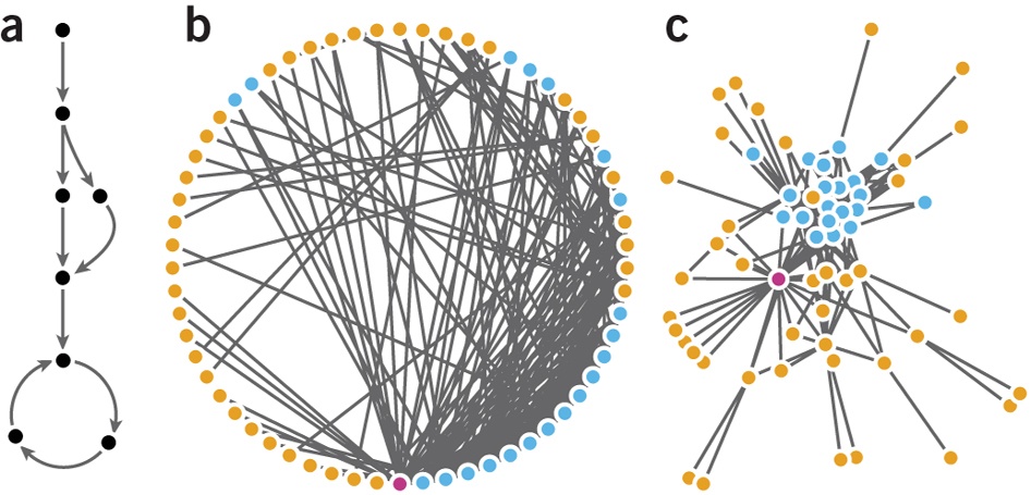
These representations rely on “graph drawing”, which is the art and science of making node-link diagrams using layout algorithms. These diagrams represent nodes as dots and edges as line segments (or curves). A significant majority of graph visualization software implement such representations: in 2007, (Henry 2007) referenced 54 (out of 55) node-link based systems in the Social Network Analysis Repository, and 49 (out of 52) on the Visual Complexity website.
Force-directed algorithms are the most common layouts. They are usually described as spring embedders (Kobourov 2013) due to the way the forces are computed: roughly speaking, connected nodes tend to be closer, while disconnected nodes tend to be more distant. More precisely, force-directed layouts compute repulsive forces between all nodes, but also attractive forces among linked nodes. Forces are calculated and applied on each node at each layout iteration to update its position until the algorithm has converged to a stable position of nodes.
All force-directed algorithms rely on a formula for the attraction force and one another for the repulsion force. The “spring-electric” layout proposed in (Eades 1984), for instance, is a simulation inspired by real life. It uses the repulsion formula of electrically charged particles (Fr = k/d2) and the attraction formula of springs (Fa = -k.d) involving the geometric distance d between two nodes. The pseudo-code is given as follows:
algorithm SPRING(G:graph):
  place vertices of G in random locations;
  repeat M times
    calculate the force on each vertex;
    move the vertex c4 . (force on vertex)
    draw graph
Fruchterman and Rheingold (Fruchterman 1991) have created an efficient algorithm using different forces (attraction Fa = d2/k and repulsion Fr = -k2/d, with k adjusting the scaling of the graph). Moreover, recent software like Gephi draw the visualization at each iteration, thus providing real-time feedback to users. When layouts are implemented with no stopping condition, users can tweak the layout parameters in real-time until they decide to stop its execution. Interaction while calculating layout is usually made technically possible by using multi-threading processing, and by using the GPU for rendering the visualization. The goal is to avoid the layout algorithm being perceived as a “black box” by the analyst (although no scientific study has been performed yet to verify this belief), and to accelerate the testing of the layout parameters to obtain an aesthetically good visualization.
The targeted visualization of force-directed layouts is a rough mapping between the distances in the projection space and the distances in the graph topology. The goal is to enable a visual interpretation of the topology using the spatial positions of nodes. When a “good” layout is applied, the resulting image hastens the understanding of the network structure by revealing visual patterns. The readability of graphical representations can be defined by the relative ease with which users finds the information they are looking for. Alternative definitions include the potential to make sense of the data, the familiarity to users, and aesthetic criteria; readability is subjective because the result should be visually appealing and depend on the analysis task. However, some metrics are available to compare layouts, such as the number of occlusions, the uniformity of edge lengths, and the number of edge crossings. A more detailed introduction to this topic can be found in (Tamassia 2013).
Other kinds of representation exist, but you should be able to cover most of your needs using matrix-based representations and nodelink diagrams. As choosing a representation may also depend on the analysis task to perform, (Henry 2007) provides the following comparison guide, see the table below.
In the next post we will go deeper in the visual language of node-link diagrams.
Sébastien
A spotlight on graph technology directly in your inbox.

