NASA is using Linkurious to make complex knowledge more readily available. Learn how graph visualization can help turn large corpus of documents into concrete insights.
Even in a mature and knowledge-driven organization like NASA, finding an answer to a common business issue can be frustrating. Past surveys at NASA have shown that most people have trouble finding the answers they need or don’t get results in an easily usable way. When internal knowledge tools and processes come up short, Google is the number one go to solution. But what to do when even Google fails?
David Meza is Chief Knowledge Architect at NASA. His job is to identify critical data and make sure it is accessible to the right people and that it can be found in a timely manner. He is leading a cross-agency search CIO and Knowledge Services working group who aims to reduce risk and enhance project success through better knowledge management.

All project managers know the importance of reviewing past lessons before starting a new project. At NASA, project managers can use the “NASA Lessons Learned system”. It is a database of lessons learned from contributors across NASA and other organizations. It contains the official, reviewed learned lessons from NASA programs and projects and covers topics like accident investigation, international partner coordination or procurement. This information should increase the likelihood of project success but in reality it is often unused by project teams.
Using the lessons learned database to prepare a project or find an answer can be a daunting task. Searching the database is difficult and sorting through the result of a given search can take hours.
« "Recently a project engineer asked me if we could search our lessons learned using a list of 22 key terms the team was interested in. Our current keyword search engine would require him to search our entire corpus of 20 million URLs. He would have to enter each term individually, select the link and save the document for review." »
The interface and limitations of the search rendered the project manager’s search effectively impossible. The answers stored in the lessons learned database contains knowledge but is hard to access. This paradox is frequent with a lot of knowledge management systems.
The challenge is not just technical too. Meza was able to work with NASA’s search team to search the 22 terms specifically in the lessons learned database. The result though was a spreadsheet of over links to 1100 documents containing the terms.
Meza had been working for a while on how to connect seemingly disparate documents without having to sort through a list of links à la Google. He decided to experiment with a new approach based on topic modeling, graph database and graph visualization.
Topic modelling is a statistical approach to discover the abstract “topics” that occur in a collection of documents. According to Wikipedia:
Intuitively, given that a document is about a particular topic, one would expect particular words to appear in the document more or less frequently: “dog” and “bone” will appear more often in documents about dogs, “cat” and “meow” will appear in documents about cats, and “the” and “is” will appear equally in both. A document typically concerns multiple topics in different proportions; thus, in a document that is 10% about cats and 90% about dogs, there would probably be about 9 times more dog words than cat words. A topic model captures this intuition in a mathematical framework, which allows examining a set of documents and discovering, based on the statistics of the words in each, what the topics might be and what each document’s balance of topics is.
Meza’s intuition was that topic modelling could help turn the disparate corpus of NASA’s lessons learned into a few high-level topics to improve knowledge discovery. Topic modelling can help a user find documents that match the topic he is interested in. More interestingly, it can also be used to correlate similar documents, helping users explore knowledge without having to do multiple searches.
A detailed explanation of how Meza used R to build a topic model for a subset of 2000 NASA’s lessons learned data is available on Neo Technology’s website.
In addition to the name of the lessons and the topics, the lessons learned data contained information about people (who submitted the different documents), organizations (where each document was produced) and categories (a metadata present in the lessons learned database). To effectively represent the connections between these different entities, Meza developed a graph model.
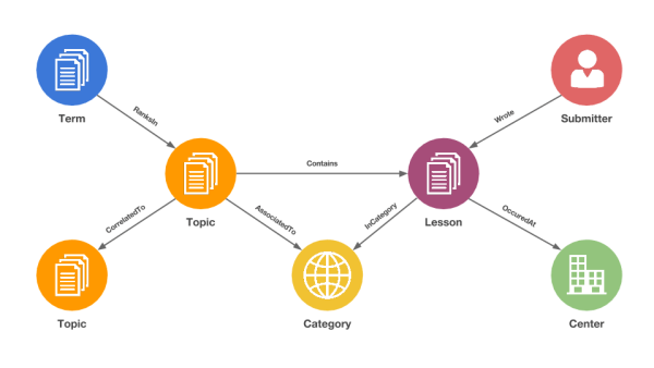
In this graph we can see that a given lesson contains a topic, is written by a submitter, occurred at a NASA center and has a category.
The graph approach of representing data as a set of nodes and edges is particularly intuitive for complex domains. The result is a map that represents the underlying connections present in a given dataset.
The Neo4j graph database contains a set of tools to import data from different format. Meza used it to turn various CSV files into a single graph of NASA’s lessons learned. You can read more about this process on Neo Technology’s website.
Collecting and storing data is only half the battle. For Meza, the ultimate goal is to improve project success through easy knowledge discovery. For that task, Meza needed a solution to search, explore and visualize graph data. He chose Linkurious as it is easy to install and directly compatible with Neo4j. More importantly, it provides an easy to use interface to extract insights from graph data.
For example, a project manager looking for lessons that may contain the terms, “fuel,” “water,” “valve” or “failure” using Linkurious would find a topic that contains “fuel”, “water” and “valve”.
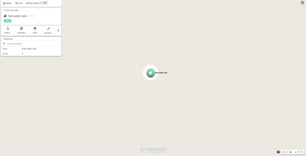
By double-clicking on this node, Linkurious allows me to view the lessons it is connected to. I can inspect the different lessons by clicking on it. For example, the “High Pressure Shutoff Valves; Vacuum Pump Isolation Valve” lesson dates back from 1992 and comes with a link.
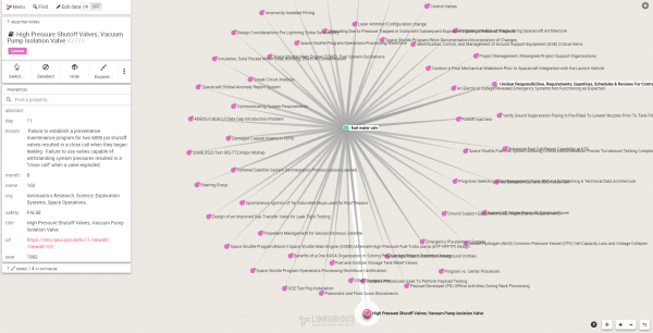
If I want to dive deeper, I can click on the “High Pressure Shutoff Valves; Vacuum Pump Isolation Valve” and learn about its connections.
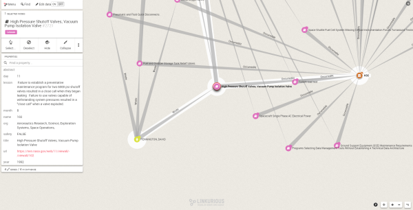
I can see David Pennington wrote the lesson and that it is linked to the KSC (the Kennedy Space Center). Furthermore, the Linkurious graph visualization interface allows me to identify a few topics which are also connected to KSC or to David Pennington including “SSME Oxygen Lines” or “Pneumatic and Fluid Quick Disconnects”.
Linkurious allows end users to explore their data in a new way and surface insights that escape current search engines. It may play an important role in NASA’s Strategy for Critical Data Visibility Through KM. Today, Meza’s experiment at NASA is still a work in progress but he hopes Linkurious “can provide users with a more effective search experience, reducing their time to find answers and allowing them to start their project on the right foot”.
Want to learn how to extract insights from your data. Try Linkurious now!
A spotlight on graph technology directly in your inbox.
