Linkedin inMaps discontinued: how to visualize your professional network now?
/!\ Some functions of the Linkedin API mentioned in the following article were depreciated. This tutorial is no longer relevant. /!\
One of the cool not-so-known feature of Linkedin was the ability to visualize your professional network. This was provided via inMaps and allowed everyone to get a feel of the communities and influencers in his own network. On August 31 this service will be discontinued but you can still visualize your Linkedin network.
First step first. We need to collect the information about our connections and their relationships. The good news is that Linkedin has a nice API anyone can use. The bad news is that this API only allows us to see our connections and the connections between them. Just like with inMaps, we will not be able to see the individuals we are not connected to.
We are going to need to register a new application with Linkedin to be able to use its API. Simply go here and sign in with your account (you do have an account, right?).
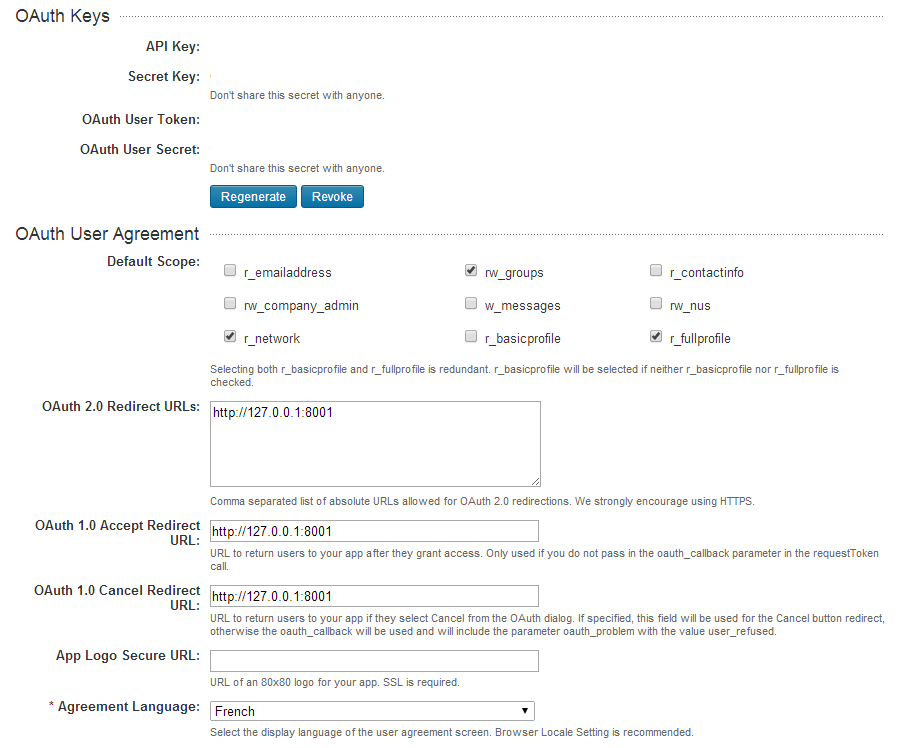
Choose “Add New Application”. Fill in your information. Choose “r_network” in the User Agreement section. In the OAuth url fields, enter “http://127.0.0.1:8001”. Copy the information about your API Key, Secret Key, OAuth User Token and OAuth User Secret. We’ll need this soon.
Save.
For the rest of the tutorial, we are going to need Python. If you do not have it yet, install it.
Start a local https server with Python : python -m HTTPServer 8001
Now it is time to start interacting with Linkedin. thankfully, Thomas Cabrol from Dataiku already went through the trouble to write some code : we are just going to use it. First, we’ll need a script for authentication.
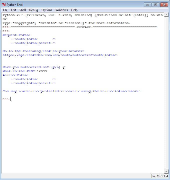
Go ahead and create on your computer a file that contains the script above. You will need to replace “your-consumer-key-here” and “your-consumer-secret-here” by your API Key and your Secret Key. Now run the linkedin-1-oauth.py script : python linkedin-1-oauth.py Copy/paste the link provided by the application in your browser. Login and authorize your application to access your data. You should be redirected to your local server and see a chain of characters. Notice the digits after “oauth_verifier”. Copy them. Now go back to your python script. Hit “y”, as you have authorized your application. Enter your oauth_verifier. You should now see more information.
Copy the values for the “oauth_token” and “oauth_token_secret”. It is time to open our second script.
Just like for the first one, copy/paste the content in a text editor. Replace the values for CONSUMER_KEY, CONSUMER_SECRET, OAUTH_TOKEN and OAUTH_TOKEN_SECRET. Replace “Thomas Cabrol” by your name.
Before you visualize the data, there is some cleaning up to do. Manually remove via a text editor or Excel all the lines that include Mr “private private”. Finally, run the last script.
The result of our work is a csv file titled linkedin.csv. It is kind of underwhelming compared to what Linkedin offered out of the box via inMaps. Don’t worry though we are going to transform this csv file in a nice graph.
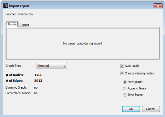
There are various ways to visualize our csv file. We are going to use Gephi, an open-source graph visualization tool.
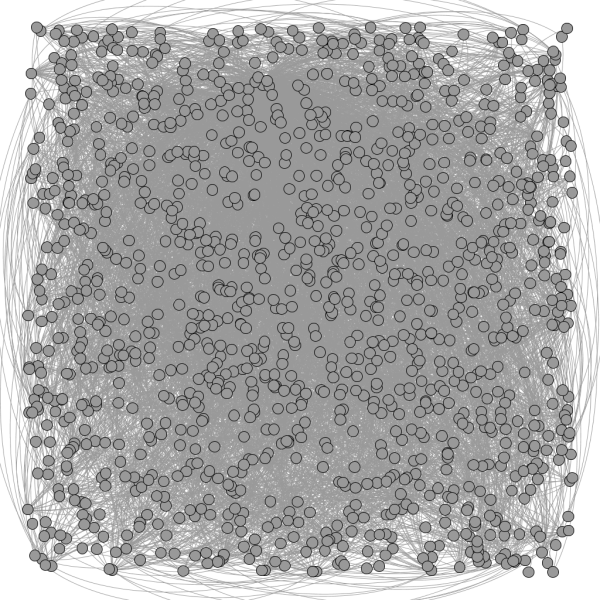
In the next screen, simply choose ok. You can see that I have 1265 contacts. My contacts and I are linked through 4895 relationships.
The initial result is somewhat disappointing. It is hard to see anything in the maelstrom of nodes and edges.
Thankfully, Gephi comes with several layout algorithms. On the left side of the screen, select “ForceAtlas 2”. Let’s put “6” in the scaling line. Hit “run”, the nodes should start changing position. The more relationships two nodes have with each other the closer they will be displayed.
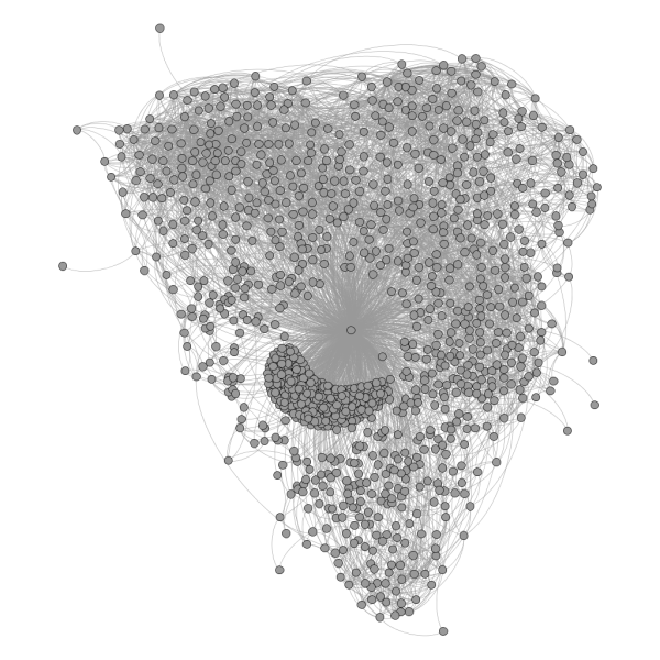
You should see a few communities appear. I was not satisfied with these results saw I went an extra mile. To better understand the communities I’m linked to I :
- activated the “Show node labels” to see who each node represented ;
- ran the modularity algorithm in the Statistics panel (on the right). I went to the partition window (select Window > Partition) and choose to color the nodes according to their “Modularity class” ;
- finally, I activated the degree range filter on the right panel ;
Part of the appeal of Gephi is that it offers so much customization options. The changes enabled me to produce this graph:
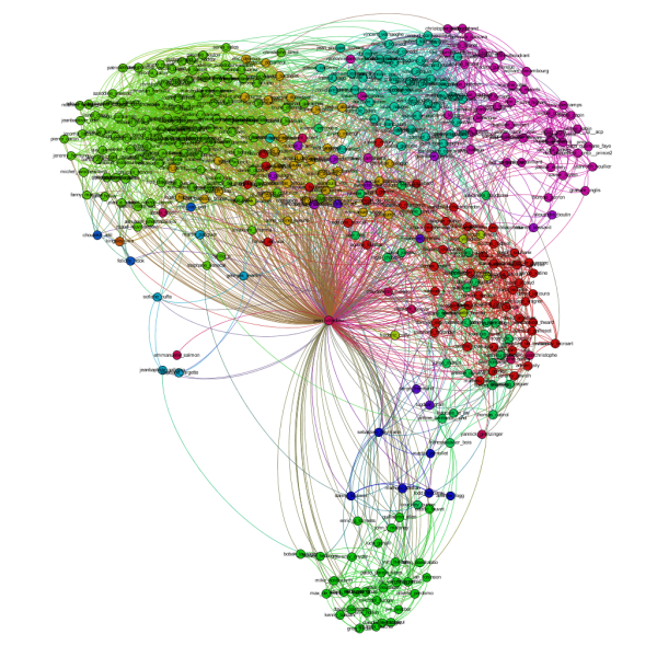
I can see in that picture the different communities I’m a part of. For example, the Neo4j folks I know are in the bottom of the screen.
We could actually load the data in our csv file into a Neo4j graphdatabase easily in one single query :
LOAD CSV FROM ‘https://gist.githubusercontent.com/jvilledieu/91d131c04e45ef34f85b/raw/48d742425afaf4dbda56f9762ffcbf2b2797763e/linkedin.csv’ AS line
MERGE (p1:PERSON { name: line[0] })
MERGE (p2:PERSON { name: line[1] })
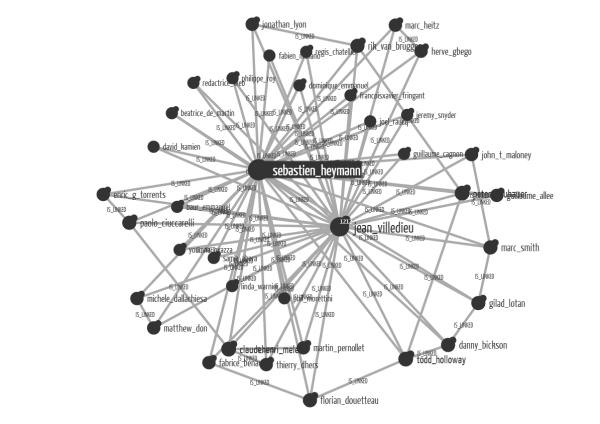
CREATE (p1)-[:IS_LINKED]->(p2)Alternatively, we can use the Chrome Developer Tools to build a Neo4j database of our Linkedin graph. Now we can simply start Linkurious and visualize it. I can for example choose to focus on the contacts Sébastien Heymann (my co-founder) and I share. Once the data is plugged into Neo4j, I just have to look up Sébastien via Linkurious and expand his relationships :
As Linkedin inMaps is shut down, it is getting harder to visualize your Linkedin network. With a little help from Python and Gephi though, you can achieve very interesting results. It would be even better if Linkedin’s API provided us with more access to the data. I’d love to see who I share schools with, who are my contacts in a specific industry, etc. And you, what questions do you want to ask to your Linkedin graph?
A spotlight on graph technology directly in your inbox.