
In this blog post our friends from NetBooster explain how to turn your website data into a graph visualization to improve your SEO keyword and content decisions.
Search Engine Optimization is a discipline of digital marketing that aims at improving websites visibility in search engines. A big part of the job consists in semantic data mining to measure interest and locate traffic growth potential.
Meanwhile, by reverse-engineering Google’s search algorithm, SEO experts tend to organize websites into meaningful architectures that will be crawled, understood and indexed by Google’s spiders.
From your personal blog to first-class online retail, the semantic and the information architecture becomes critical indeed when Google has to decide what page – from a competitor or from your website – will rank first in the search results pages.
<h1 style="margin-bottom: 0.618em; font-size: 37px; font-family: "Open Sans", sans-serif; font-weight: 300; line-height: 1.387em; color: rgb(30, 29, 50); text-align: center; border: 0px; vertical-align: baseline; letter-spacing: normal; white-space: normal;"><span lang="en-US" style="margin: 0px; padding: 0px; border: 0px; vertical-align: baseline;">Data-driven SEO</span></h1>
For many years, SEO expertise was mostly based on test & learn tactics, but we, at NetBooster, encourage the use of data to predict and measure SEO success.
While collecting data to shape website structure was a complex challenge, it became obvious that graph visualization could help us to make sense out of it: a website is just another network of nodes (webpages) linked with each other.
So we started by collecting SEO datasets: site crawl, site-centric search, user-centric search, site rankings.
By definition, a website is a network of files (most often HTML documents also called web pages) linked with each other. But a page can also link to another without reciprocity.
According to the size of the website, the vast amount of pages and links between them can quickly be overwhelming. Thus, SEO experts use software to crawl every page and every link of a website. The site crawl results in a table listing them all (cf. sample data below: the page car.html has a link toward the page plane.html).
This network of nodes and links will be the foundation of our graph database.
Google Search Console is a free tool providing search data for a given site. It offers webmasters an overview of the performances of their website for each specific query searched by its visitors (cf. sample data below: the keyword car has driven 20 visits from Google to the page car.html).
This data will be useful to determine which queries, searched in Google, actually drive traffic to a website’s page. Most of the times, it results in thousands of entries.
Google Keyword Planner is another free tool provided by the firm from Mountain View. It helps SEO experts to weight search volumes for thousands of queries and prioritize actions (cf. sample data below: the keyword car has been searched for 12,000 times last month).
As each keyword is thoroughly categorized, SEO experts can group them into clusters of intention and extrapolate the search demand for broader intents (for example, keywords like car, plane and train could be grouped into a transportation cluster and cumulate a search volume of 24,000 queries per month).
This taxonomy is fundamental to narrow the scope of the site mappings and to prioritize the most strategic topics: you can easily decide whether to prioritize creation of content dedicated to transportation or to accommodation.
After collecting and importing the data into a graph database (we decided to use Neo4J associated with Linkurious after unfruitful results using Gephi) we were able to request any node of our website and display links between them:
- Keyword nodes, collected through site-centric search data and user-centric search data;
- Page nodes, collected through site crawl data.
This is when we started turning our website’s data into visualization.
Once imported into Neo4J database and displayed through Linkurious, we could now display all keywords related to a category and see which of them were actually driving traffic to the website.
In the example below, keywords related to management (strategic management) generated visits toward 2 pages of the website (gray nodes). The size of keyword nodes shows its monthly search volume (manager is more requested than management).
In this other example, keywords related to finance drive no traffic at all to the website.
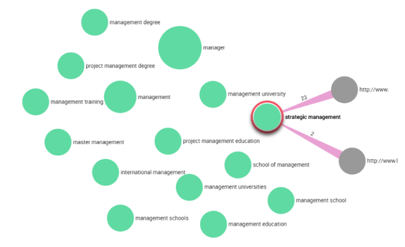
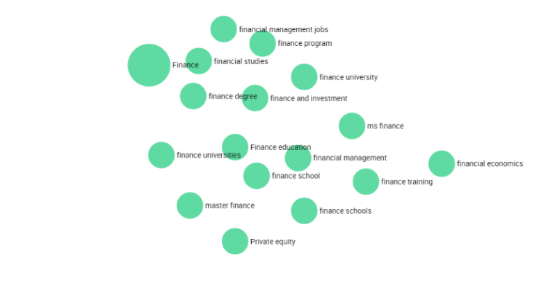
Following this methodology, the analysis of all topics identified in the user-centric search data can characterize traffic to a website and reveal growth potential: topics which have no responding page can be addressed through content creation.
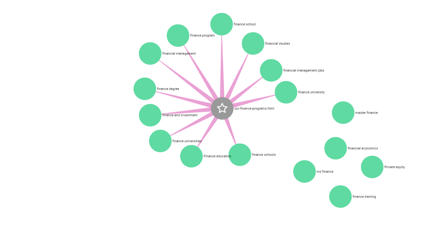
Creation of pages reflecting consistent semantic structures was a fastidious task. And unfortunately, we had to move each node manually in order to design meaningful patterns as we didn’t know yet about the weight option of the ForceLink Layout (that would distribute nodes according to the weight of their link) available in the SDK.
In the figure below, we created a new page (starred gray node) intended to capture traffic from finance related keywords: our-finance-programs.html
But these structures can be much more complex, depending on the size of the keyword clusters. In the example below, the keywords related to the topic degree, have been manually reorganized into several subclusters, each linked to a dedicated new page.
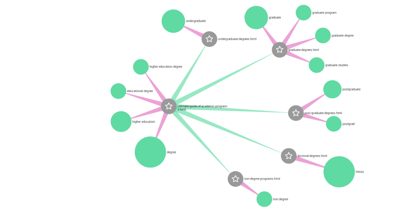
Finally, the visualization of web structures mixing pages (existing or new) and keywords (driving traffic or not yet) often results in complex mapping.
But beyond its apparent complexity, such visualization can offer a consistent roadmap for content creation and deployment in order to gain more visitors: each existing page must be edited in order to address its semantic field properly; each new semantic field can be addressed through the creation of a specific content. And all must be linked together within a meaningful organization.
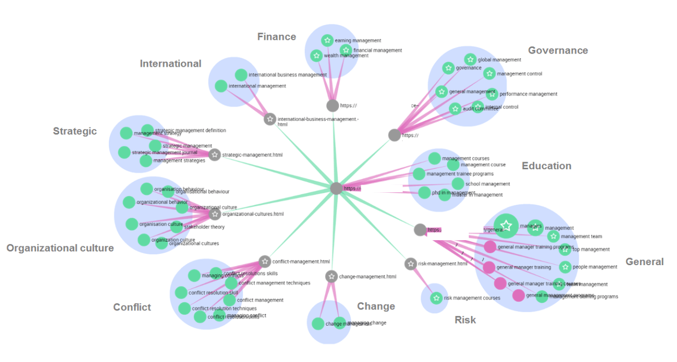
Ps: many thanks to Olivier Tassel for inspiring this visualization and to Dimitri Tacita for making it possible.
About the author
Grégory DOMINÉ, Content Marketing Manager

Graduated from Université de Provence, Grégory has started his digital career at Groupe Figaro. For 7 years, as digital project manager and team leader (web studio), he was in charge of editorial products of lefigaro.fr where he built a solid editorial expertise. In 2008, he founded Mediastroika, a web development agency, and contributed to numerous digital projects for SFR, l’Equipe, Le Figaro, L’Architecture d’Aujourd’hui and The World Coalition Against Death Penalty. In 2013, Gregory joined Agence Publics, as a digital consultant, where he provided his strategic vision and technical expertise to Non-Governmental Organizations and the political sphere. In 2015, Grégory chose NetBooster and joined this digital pure player as content marketing manager.
Grégory advises clients from multiple sectors in setting up their data-driven content strategies. Thanks to his editorial expertise and the data savoir-faire of the agency, he developed the Content Marketing offer of NetBooster.
A spotlight on graph technology directly in your inbox.
