On January 15, BuzzFeed released a large dataset of Donald Trump’s connections, including people, organizations and the nature of their relationships. In this post, we showcase Donald Trump political network visualization based on that dataset.
In their article “Help Us Map TrumpWorld”, the four authors of the investigation, John Templon, Anthony Cormier, Alex Campbell, and Jeremy Singer-Vine, asked the public to help them understand and analyze the data.
« Now we are asking the public to use our data to find connections we may have missed, and to give us context we don’t currently understand. We hope you will help us — and the public — learn more about TrumpWorld and how this unprecedented array of businesses might affect public policy.” »
So we decided to see what it would look like in Linkurious Enterprise, our graph analysis and visualization tool.
The Trump political network visualization dataset is publicly available in a Google spreadsheet. We imported it in a Neo4j graph database using the following script inspired by Michael Hunger’s work:
The result is a graph of 770 nodes and 611 edges. We then connected Linkurious Enterprise to this dataset to start exploring it. Following, are some visual representations of the TrumpWorld dataset in Linkurious:
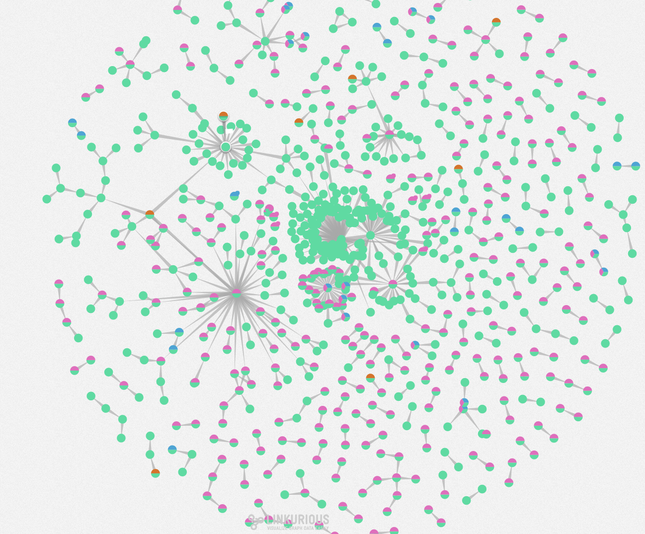
To clarify the visualization, we added some custom labels. All nodes are organizations. The ones whose name contains the word “bank” are half orange. The ones whose name contains the word “hotel” are half-blue. And the ones whose name contains “Trump” or “DT” are half pink. The other ones are entirely green.
As reported by Forbes in May 2016, Trump’s Personal Financial Disclosure (PFD) listed the future President as being associated with 515 different organizations. Among his most valuable assets were the Trump Tower Commercial LLC and the 40 Wall Street LLC. Let’s look up the connections between those two entities.
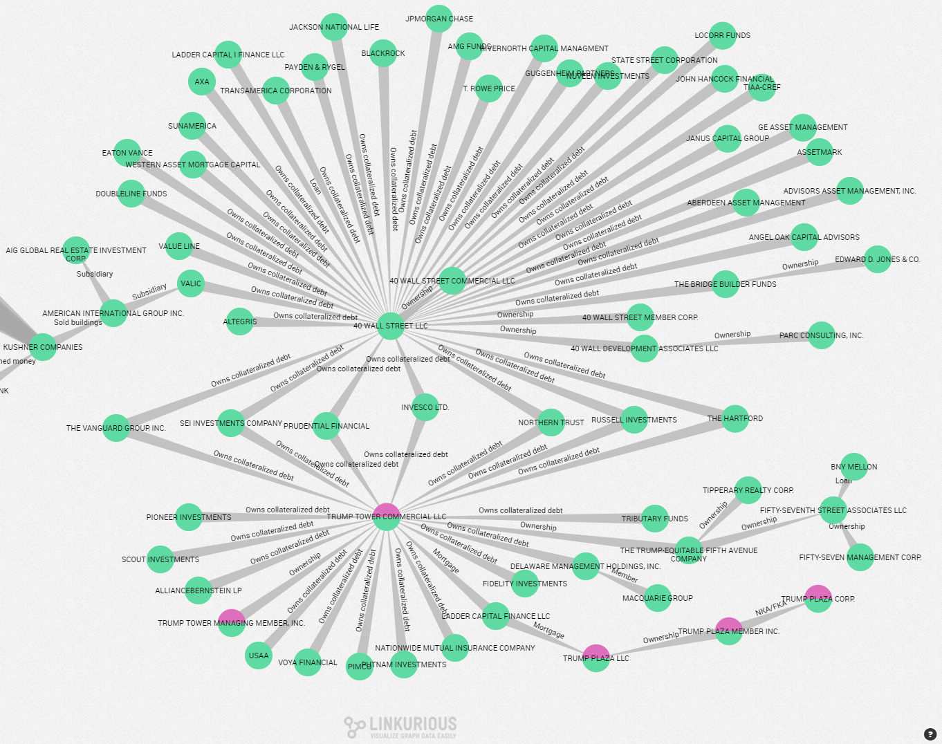
The Trump Tower Commercial LLC and 40 Wall Street Commercial LLC have seven connections in common. Both companies share a “owns collateralized debt” with investment funds and assess management companies such as The Vanguard Group or Russell Investments.
We can also look into details in DJT Holdings LLC, one of Donald Trump’s most important asset:
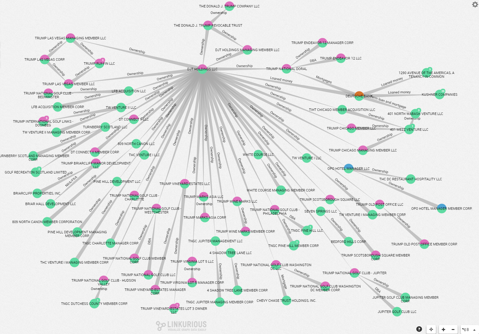
The visualization shows that DJT Holding LLC is connected to a lot of other companies via an “ownership” relationship. The company owns more than 30 other organizations, working as a corporate umbrella for the Trump Empire. DJT Holdings is itself owned by the Donald J. Trump Revocable Trust.
Finally, if you look into the famous Trump Hotel & Casino Resorts incorporation, we get the following result:
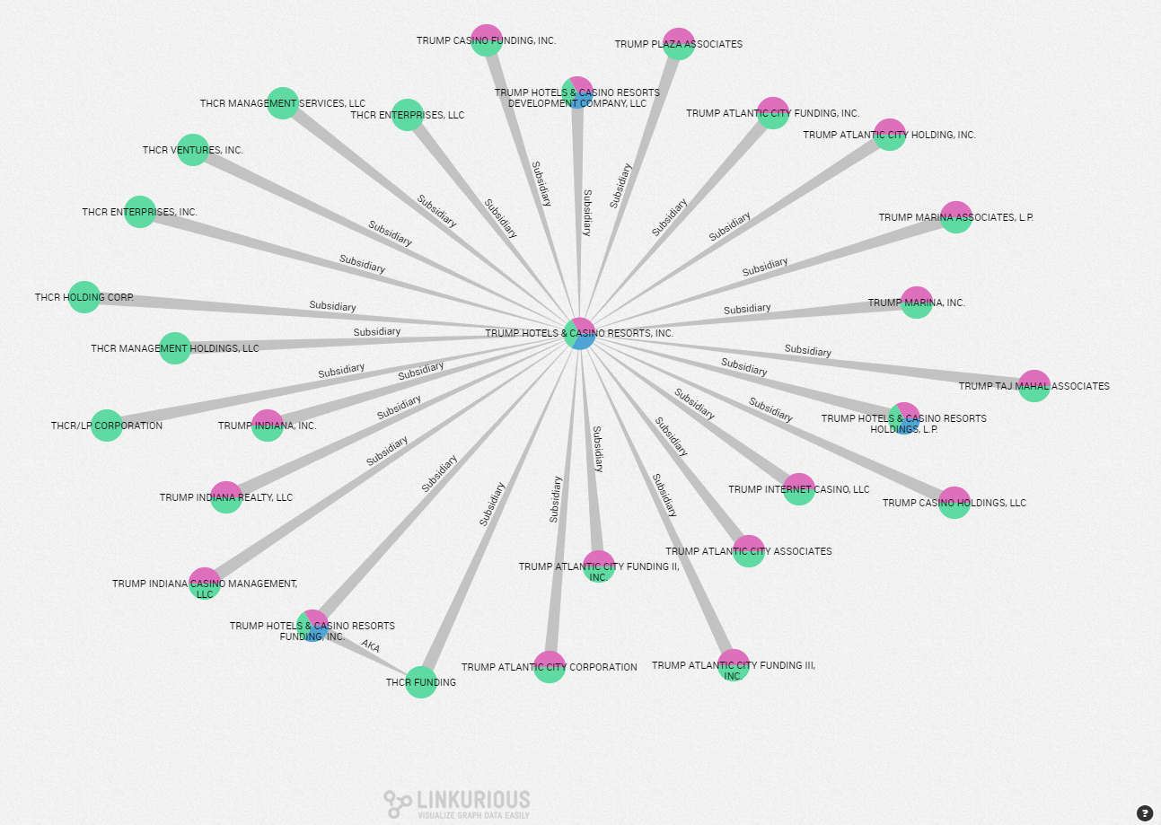
Around thirty organizations gravitate around the Trump Hotel & Casino Resorts Incorporation as “Subsidiaries”. Once again it confirms the taste of Donald Trump for complicated corporate structures.
Graph visualization tools help understand complex connections within large datasets. The Trumpworld dataset was turned into a clear view of the network of organizations around Donald Trump. We can identify key organizations and scheme quickly. You can read other use cases of graph visualization on our blog.
A spotlight on graph technology directly in your inbox.
