This post is part of a series of 3 articles about the GraphTech ecosystem. This article is the third and last part. It presents the ecosystem of graph visualization software, applications and libraries. The first part is about the landscape of graph databases and the second part covers the graph analytics ecosystem.
You will find at the end of this article, a presentation listing visualization tools for graph data, from development libraries to web application and add-ons.
The third layer of graph technology that we discuss in this article is the front-end layer, the graph visualization one. The visualization of information has been the support of many types of analysis, including Social Network Analysis. For decades, visual representations have helped researchers, analysts and enterprises derive insights from their data.
Visualization tools represent an important bridge between graph data and analysts. It helps surface information and insights leading to the understanding of a situation, or the solving of a problem.
While it’s easy to read and comprehend non-graph data in a tabular format such as a spreadsheet, you will probably miss valuable information if you try to analyze connected data the same way. Representing connected data in tables is not intuitive and often hides the connections in which lies the value. Graph visualization tools turn connected data into graphical network representations that takes advantage of the human brain proficiency to recognize visual patterns and more pattern variations.
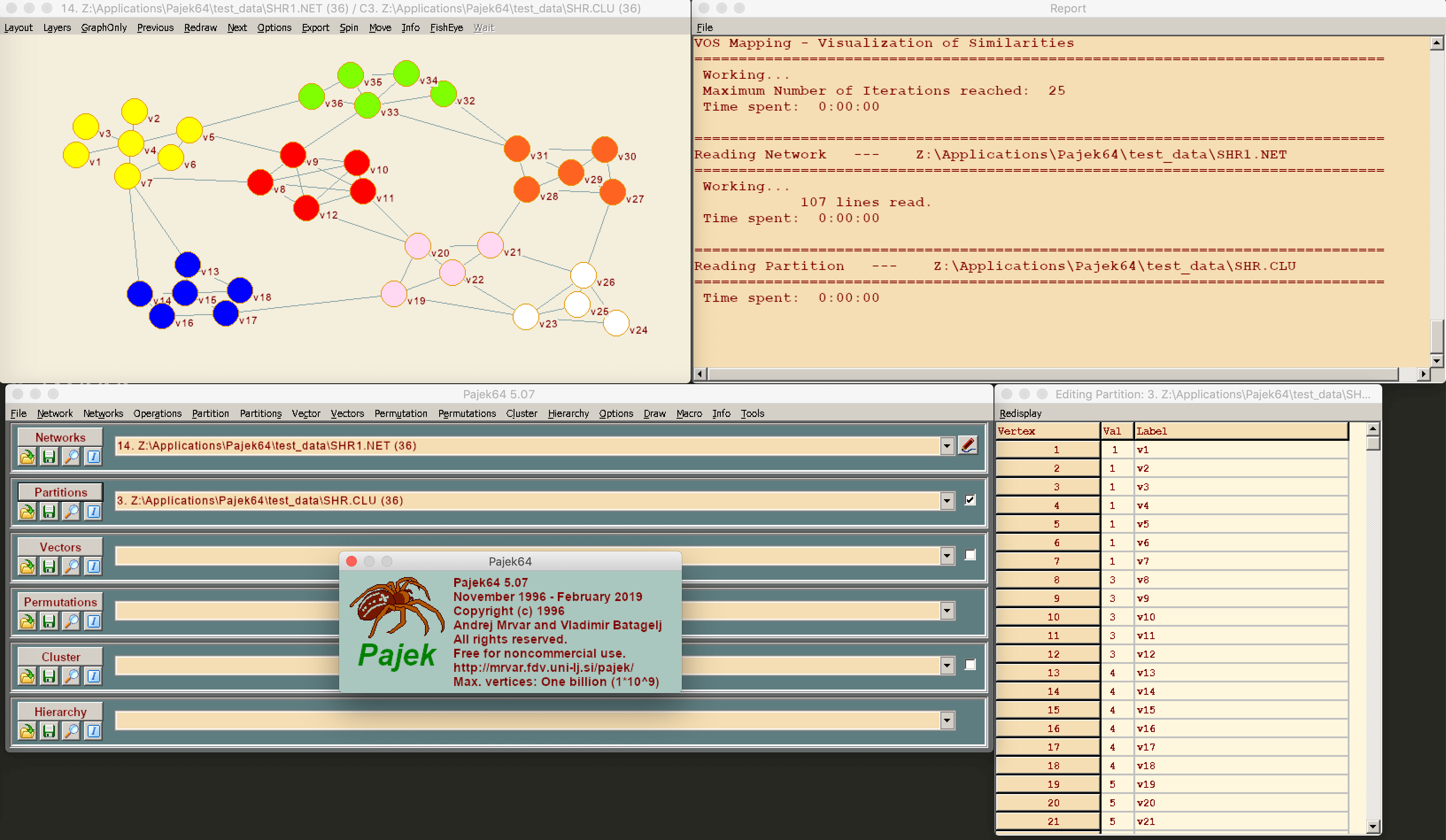
In the field of graph theory and network science, researchers started to imagine graph analysis and visualization tools as early as 1996 with the Pajek project. Even though these applications have long been confined to the field of research, it was the birth of computer tools for graph visualization.
There is a reason researchers started to develop these tools. As we previously wrote, graph visualization is critical for the analysis of graph dat. When you apply visualization methods to data analysis, you are more likely to cut the time spent looking for information because:
- You have a greater ability to recognize trends & patterns.
- You can digest larger amounts of data more easily.
- You will compare situations or scenarios more easily.
- And in addition, it will be easier to share and explain your findings through a visual medium.
Combined with the capabilities brought by computer machines, these advantages opened new doors for analysts seeking information in large volumes of data. It is also the reason graph visualization solutions are complementary to the graph analytics and graph databases tools we discussed in the previous articles. Once data is stored and calculations are done, end-users need an intelligible way to process and make sense of the data. And graph visualization tools are useful in many scenarios.
You need to identify shady financial schemes in terabytes of data? Graph data visualization. You need to understand the human dynamic between criminal networks? Graph data visualization. You need to quickly assess the fraudulence of flagged transactions? You guessed it, graph visualization.
Most of the tools we are about to present can be plugged directly to database and analytics systems to further the analysis of graph data.
Among the common tools available today to visualize graph data are libraries and toolkit. These libraries allow you to build custom visualization application adjusted to your needs: from a basic graph layout displaying data in your browser, to an advanced application embedding a full panel of graph data customization and analysis features. They do require the knowledge of programming languages, or imply that you have development resources available.
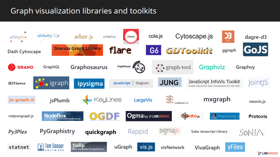
The catalog is wide, with plenty of choices depending on your favorite language, license requirement, budget or project needs. In the open-source world, some libraries offer many possibilities for data visualization, including graph, or network, representations. It’s the case of D3.js and Vis.js for instance that let you choose among different data representation formats.
Other libraries solely focus on graph representations of data, such as Cytoscape.js or Sigma.js. Usually, these libraries provide a more features than the generalist ones. There are libraries in Java such as GraphStream or Jung, or in Python, with packages like NodeBox Graph.
You will also find commercial graph visualization libraries such as yFiles from yWorks, Keylines from Cambridge Intelligence, Tom Sawyer Perspectives from Tom Sawyer Software, or our own solution Ogma. The commercial libraries have the advantage of guaranteeing continuous technical support and advanced performances.
There are other solutions which do not require any development. These solutions are either, Saas, or on-premise software and web applications. As we mentioned earlier, the first off-the-shelf solutions spawn from the work of network theory researchers. After Pajek, other solutions were released, such as NetMiner in 2001, a commercial software for exploratory analysis and visualization of large networks data. In the same line, the Gephi software, created in 2008, brought a powerful open source tool to many researchers in the field of Social Network Analysis. Co-founded by Linkurious’ CEO, Sébastien Heymann, Gephi played a key role in democratizing graph visualization methods.
Other research projects emerged, as web technologies simplified their creation. For instance, Palladio, a graph visualization web application for history researchers was created in 2013. More recently in 2016, the research project OSoMe (the Observatory on Social Media) released an online graph visualization application to study the spread of information and misinformation on social media.
However, graph visualization is no longer the preserve of the academic and research worlds. Others understood the potential of graph visualization and how such tools could help organizations and businesses in other fields: network management, financial crime investigation, cybersecurity, healthcare development, and more. Companies started to provide enterprise-ready graph visualization solution, as did Linkurious back in 2013.
Today you can easily find software or web applications to visualize graph data of various natures. Bakamap is a web application to visualization your spreadsheet data as interactive graphs. The cloud-based application BeGraph offers a 3D data network visualizer. Historical open-source software such as GraphViz and Cytoscape also let you visualize any type of data as interactive graphs.
Some companies propose solutions dedicated to certain use-cases. In these cases, the graph visualization application is often enhanced with features specially designed to answer needs specific to the given field. For instance, the Linkurious Enterprise graph visualization platform is dedicated today to anti-fraud, anti-money laundering, intelligence analysis, and cybersecurity scenarios. So in addition to graph visualization, it proposes alerts and pattern detection capabilities to support the work of analysts in these fields. Another example of a field-specific tool is VIS (Visual Investigative Scenarios), a tool designed by the OCCRP for journalists investigating major business or criminal networks. Synapp, on another hand, is an application dedicated to the visualization of human resources within organizations. As the adoption of graph technology spread, more and more areas are witnessing the development of specific graph visualization tools.
Finally, the last set of tools dedicated to the visualization of graph data are the built-in visualizers and graph database add-ons.
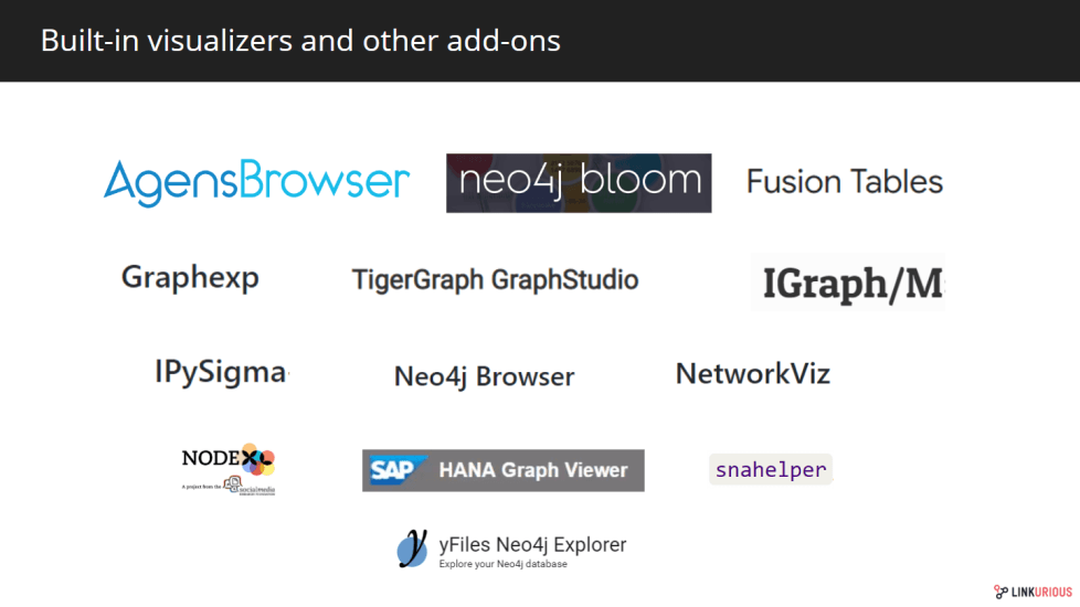
While graph visualization software and web applications are great for in-depth analysis or advanced graph data investigations, there are situations where you simply need a basic, accessible visualizer to get a glimpse of what a given graph dataset looks like. That is why some graph databases ship with built-in graph data visualizers. These features are a great asset for developers and data engineers working with graph data. Without leaving the graph database environment, you can easily access a graphical user interface to query and visualize your data. This is what the Neo4j browser offers for instance, which can be of great help when creating datasets or running graph algorithms. Similarly, TigerGraph proposes a built-in graphical user interface: GraphStudio to visualize your database content. Last year, Bitnine released AgensBrowser, a visualization interface to help you manage and monitor the content of your AgensGraph graph database.
On a similar notice, graph database vendors have started to widen their offerings with add-on visualization tools compatible with their storage product. For example, at the beginning of last year, Neo4j launched Bloom, an add-on application for the Neo4j desktop application. It offers a code-free visualization interface to explore data from Neo4j graph databases.
We listed and presented in the following presentation a majority of visualization tools for graph data. You can request the complete list of software and web-applications here.
Trough this three-part series, our hopes were to provide a clearer overview of the fast-growing GraphTech ecosystem. Whether it’s about graph databases, graph analytics or graph visualization tools, the landscape has shifted and expanded rapidly these past years and will most likely continue to do so in the coming years. We are thrilled to be part of this community here at Linkurious and hope to see more graphs in the world! Feel free to comment below these series to submit additional graph tools and services.
A spotlight on graph technology directly in your inbox.
