

Graph visualization helps analysts and investigators uncover what dashboards and spreadsheets can’t: the hidden connections between people, places, transactions, and events. It transforms complex, abstract data into intuitive visuals, making it easier to explore patterns, detect anomalies, and make faster, more informed decisions.
In this guide, you’ll learn what graph visualization is, how you can apply it to your data analysis projects, and how to successfully get started using graph visualization software to open new horizons for discovery and insight.
Graph visualization is the process of visually representing entities (nodes) and the relationships between them (edges) as an interconnected network diagram. It shows both individual entities and the relationships between them. It can also be referred to as network visualization or link analysis.
A graph visualization is displayed as a network, with individual data points connected to others via links that represent how they are connected. A network visualization can represent any number of things: how goods are transported from one place to another within a supply chain, how different parts of an IT system are connected, or transactions between accounts.
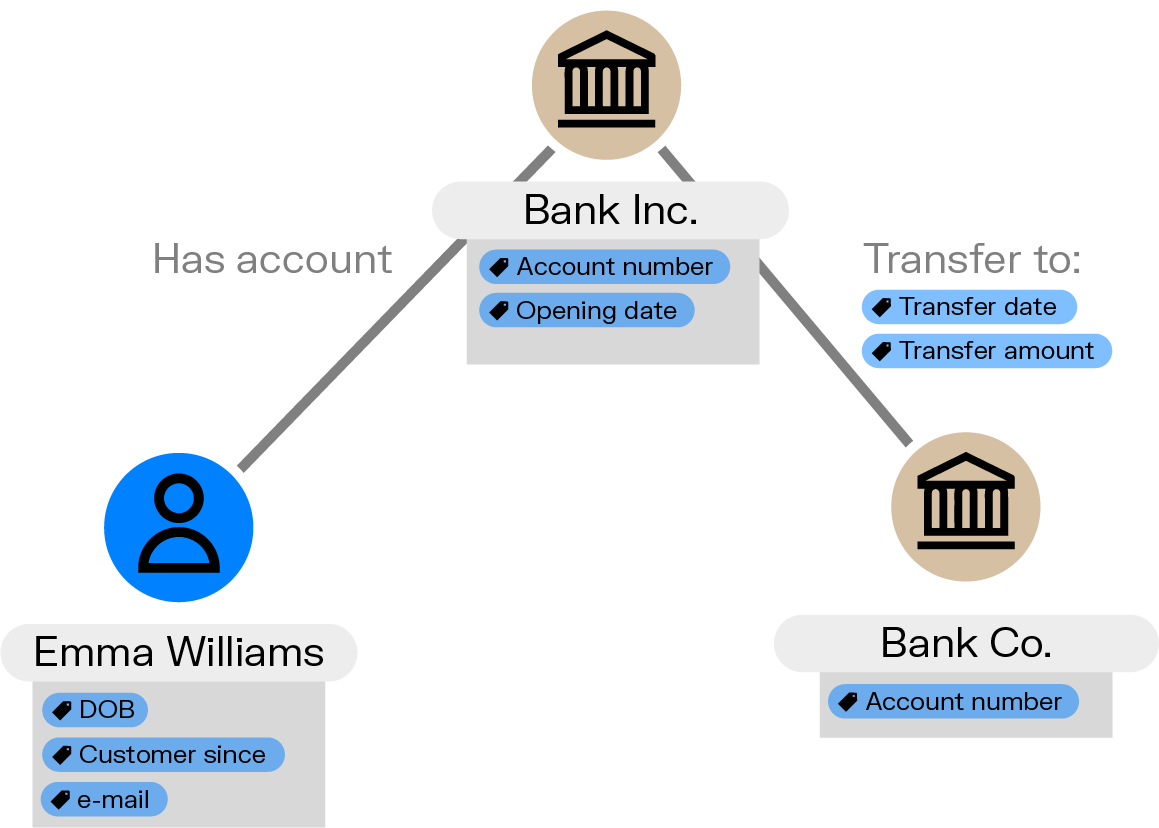
A graph is a network made up of a collection of nodes (or vertices) and edges - also called links or relationships.
- Node: A single data point such as a person, a phone number, a supplier, a bank account, a contract, etc.
- Edge: How two nodes are connected. A person possesses a bank account, for example.
Nodes and edges can have properties: additional information associated with them. For instance, the amount of a bank transfer would be a property.
Graph data is stored in a graph database such as Neo4j, Azure Cosmos DB, Amazon Neptune, or Memgraph.
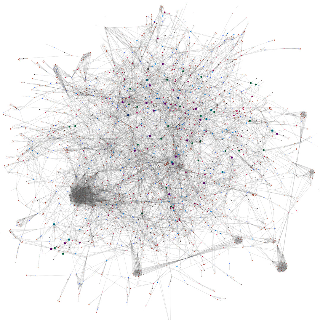
Graph analytics provides algorithms that help data scientists and data-driven analysts answer questions or make predictions. This way of representing data is well suited for scenarios involving connections and networks of entities, like supply chain networks, telecommunication networks, networks of suspected fraudsters, and much more.
When the nodes and edges of a graph are displayed as a graph visualization, it becomes intuitive to explore the connections within this data.
Dedicated algorithms, called layouts, calculate the node positions and display the data on two (sometimes three) dimensional spaces. Some examples of layouts are force-directed where larger or more important elements are closer to the center, or radial layout, where nodes are arranged in concentric circles, showing dependencies.
These visualizations are data modeled as graphs. Any type of data asset that contains information about connections can be modeled and visualized as a graph, even data initially stored in a tabular way. For instance, the data from our example above could be extracted from a simple spreadsheet.
The data could also be stored in a relational database or in a graph database, a system optimized for the storage and analysis of complex and connected data.
In the end, graph visualization is a way to better understand and manipulate connected data. And it offers several advantages.
Interactive visualization tools are an essential layer for those using graph technology to identify insights and generate value from connected data. Graph visualization comes with many advantages for organizations that need to analyze and explore their connected data.
Easy to understand
Visualizing data as a graph lets you spend less time assimilating information because the human brain processes visual information much faster than written information. Visually displaying data ensures a faster comprehension which, in the end, reduces the time it takes to make decisions and take action.
Discover more insights in your data
You have a higher chance of discovering insights when interacting with data. Graph visualization tools make it intuitive to manipulate and explore data. This encourages data appropriation and increases the possibility of discovering actionable insights. A study showed that managers who use visual data discovery tools are 28% more likely to find information in less time than those who rely solely on managed reporting and dashboards.
See the full context
You can achieve a better understanding of a problem by visualizing patterns and context. Graph visualization tools are perfect for analyzing relationships but also for comprehending the context of the data. You get a complete overview of how everything is connected which allows you to identify trends, relationships, patterns, and correlations in your data.
Share your findings easily
Graph visualization is an effective form of communication. Visual representations offer a more intuitive way to understand the data and are an impactful medium to share your findings with decision-makers.
Accessible to non-technical users
Everybody can work with graph visualization; it’s not limited to technical users or developers. More users can access the insights since specific programming skills are not required to interact with graph visualizations. This increases the value creation potential.
Let’s illustrate some of these benefits with a very simple example. We have sample data for eleven individuals with information about who works with who. Below is the same data sample in two formats: a table and a graph visualization.
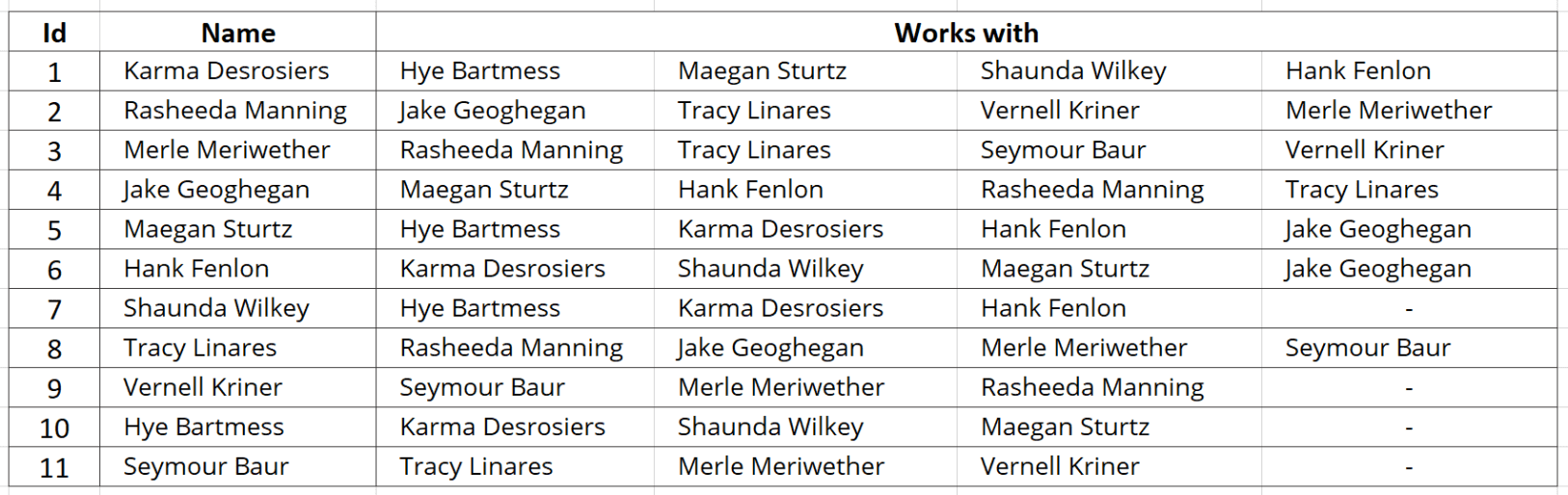
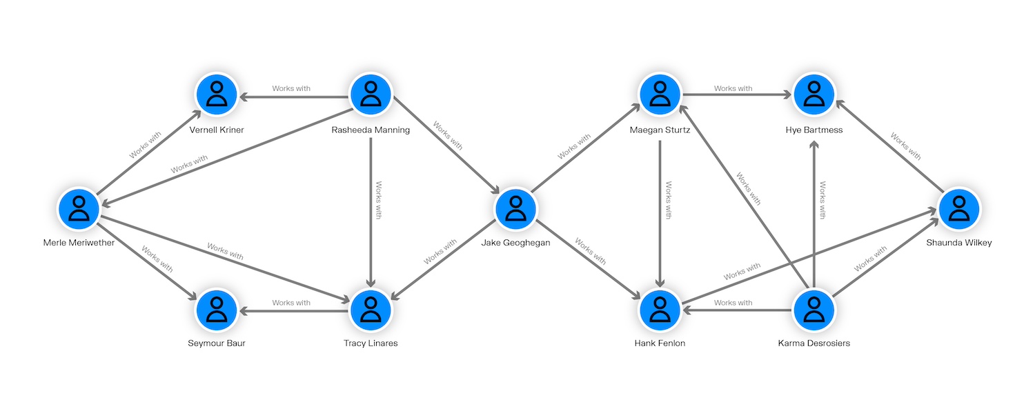
In the second format, we’ve modeled the relationships between individuals as edges to obtain a graph.
While in the first table it’s pretty hard to understand how the people in the data set work together, we get a clearer view in the graph visualization. We are able to distinguish two groups and an individual who seems to be the link between them, a pattern that we did not notice at first in the table.
Many industries are using graph technology to get more value from their connected data and reach their goals. Their common point, however, is the need to find connections or understand dependencies within their data. Here are a few examples of graph visualization use cases and how different kinds of organizations are using this technology.
Financial crime investigation
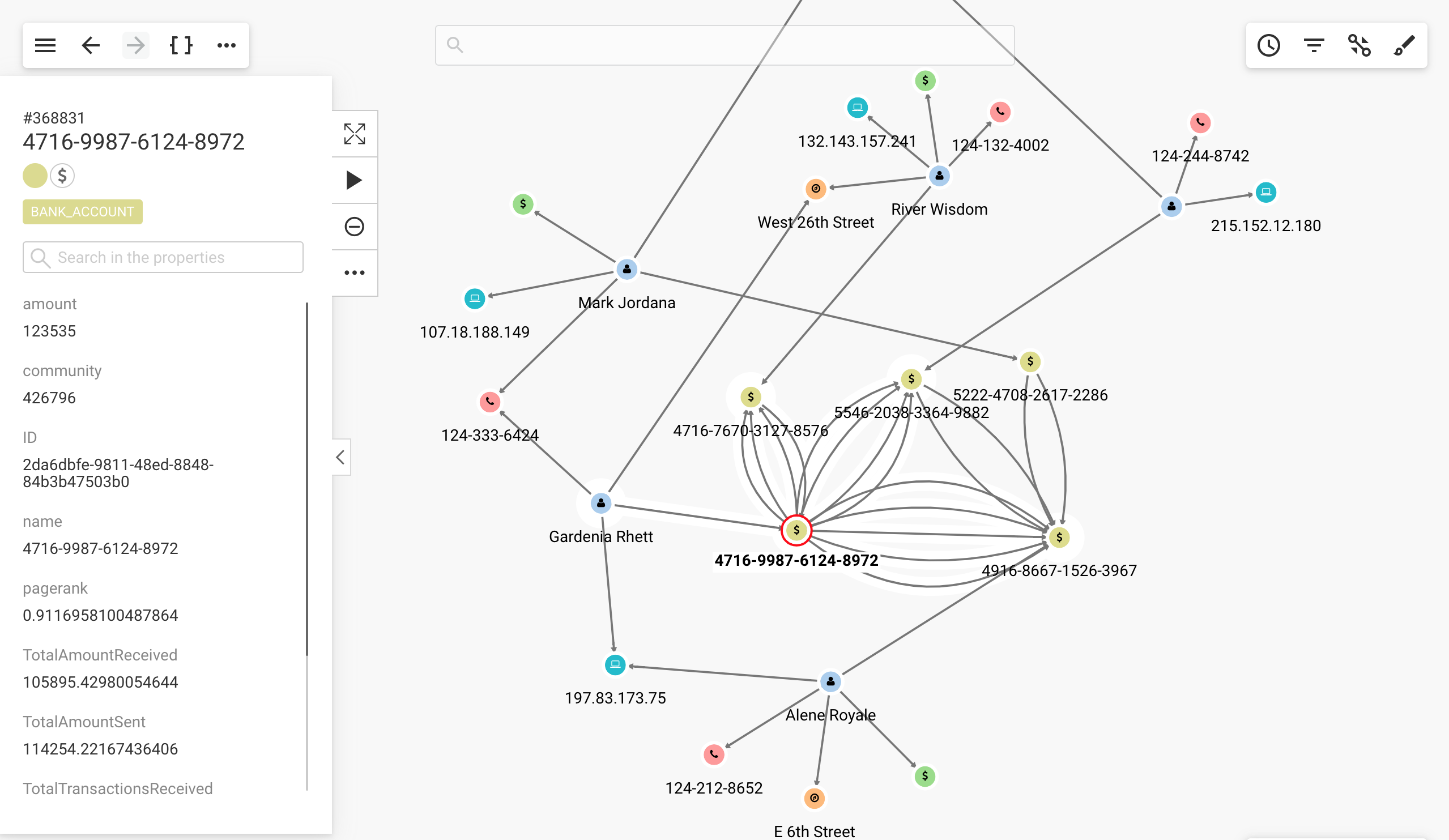
Financial institutions and insurance companies are up against increasingly sophisticated criminal schemes. From money laundering to insurance fraud to bank fraud, each of these organizations is required by compliance policy to detect fraud schemes, no matter how complex.
Their data often combines internal data such as customer information, claims details, and financial records, with external data such as information on politically exposed persons (PEPs) and sanctioned individuals or organizations. For these organizations, graph visualization is an efficient way to detect suspicious connections or patterns. It’s also an intuitive way to investigate fraud rings and criminal networks.
See how graph visualization empowers financial crime investigators:
Cybersecurity
Organizations need to protect themselves from threats like zero-day vulnerabilities and DDoS or phishing attacks. Cybersecurity teams are now common in many large organizations including financial institutions, government agencies, and more. They collect data from servers, routers or application logs and network status in order to detect suspicious activity.
Graph visualization is a powerful tool to digest this data and detect suspicious patterns at a glance. Being able to visually explore connections makes the finding of compromised elements easier and more time efficient.
Intelligence
To support law enforcement, national security or military objectives, intelligence agencies collect and analyze data from various sources. The detection and identification of terrorist networks, for instance, has become a crucial objective in the past decades. Graph visualization enables intelligence analysts to see and explore connections between people, emails, transactions, phone records, and more, significantly accelerating investigations and making it easier to spot suspicious activity.
IT operations management
The field of IT operations management keeps growing with our increasing reliance on computer systems, networks and the growth of the Internet of Things. But as infrastructures become more complex, managing networks is often a challenge.
Graph visualization allows IT managers to visualize dependencies between their assets (servers, switches, routers, applications, etc). It’s an intuitive way to perform impact or root cause analysis.
Enterprise architecture
Many organizations implement enterprise architecture management. It consists of synchronizing business and IT data. The goal is to analyze, plan, and transform the business processes, applications, data, and infrastructure to maintain the organization's ability to change and innovate.
With graph visualization, enterprise architects can visualize the organization’s assets and their dependencies. It helps to conduct impact analysis, obtain insights on the current situation and plan the right actions.
Supply chain management
Modern supply chains are complex, connecting many disparate places, people, and parts. It’s challenging to manage risk, compliance, and fluctuations in buyer behavior. Getting any of these things wrong can prove costly.
Graph visualization is able to bring together various data sources into one graph and provide real-time, end-to-end visibility of supply chain operations. Using graph, analysts can quickly and easily identify bottlenecks, track shipments, and monitor supplier performance. They can also use graph visualization to pinpoint weak spots to devise contingency plans before problems arise.
Getting started successfully with graph visualization can take some planning and forethought, but the benefits can be considerable: intuitive data exploration, a view of the full context around your data, and insights that would otherwise remain invisible.
Off the shelf or build your own tool?
There are two main options to consider first: you can build your own graph application using a graph visualization library such as Ogma, or you can use an off-the-shelf product.
Developing your own application offers a high degree of flexibility - an important consideration for some organizations and projects. This option requires both technical expertise and development resources, so it’s also not the most suitable solution for everyone.
An off-the-shelf graph visualization solution requires some technical know-how, but you can get up and running more easily. Product features are available out of the box, so you don’t need to devote resources to developing them yourself.
Leading a successful graph visualization project
One of the most important aspects of leading a successful graph visualization project is to carefully consider your goals, your team make-up, and technical needs before you jump in. Establishing clear parameters and goals will help you define your project and keep it on track. Ask yourself questions like:
- What are you trying to achieve?
- What problems are you currently facing?
- How are you currently handling those challenges?
Consider, too, how you will measure your project’s success. Establishing KPIs from the get-go will enable you to determine down the road if your project has achieved its goals.
We published an entire article on how to successfully lead a graph project, from establishing goals to sorting out the technical aspects. Read more here.
Linkurious Enterprise helps organizations extract insights from complex connected data. The software offers an easy-to-use graph visualization and analytics platform, accessible to both technical and non-technical users.
Used by teams of analysts and investigators, Linkurious Enterprise provides an intuitive UI to visually explore and investigate complex data from multiple sources. It facilitates the discovery of new insights and speeds up decision making.
Learn more and start getting more value from your connected data.
Last updated: 5 May 2026.