Network visualization is a dynamic tool for visually displaying connected data. Seeing the connections within data visually opens up plenty of possibilities for organizations across industries to gain more insights quickly and intuitively, to improve teamwork and collaboration, and more. This article explores the ins and outs of network visualization: What it is, how it works, and why it’s an asset across multiple use cases.
Network visualization, also referred to as graph visualization or link analysis, is a method of visually representing relationships between various elements or entities within a network. This type of visualization simplifies the complex nature of the network, making it easier to understand, analyze, and interpret: essentially, a picture is worth a thousand words.
Network visualization is a way of representing connected data, or graph data. To better understand graphs, let’s take a quick look at the basics of graph technology. Graph analytics is a way of analyzing not only individual data points but also the relationships between them. Here's how it all comes together:
Graph basics:
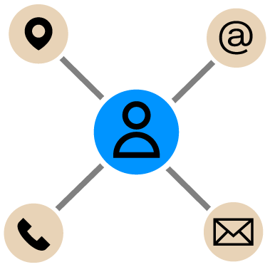
- A graph is made up of nodes (also called vertices) and edges (also known as links or relationships).
- A node represents an entity like a person, business, or address.
- An edge represents how two nodes are connected, for example, “a person owns a business.”
Storage and analysis:
- This data is stored in a graph database, which supports querying and analysis through graph algorithms.
- Analysts and data scientists use these tools to explore patterns in both the entities and their relationships.
Visual representation:
- In a network visualization, nodes and edges are displayed as an interactive diagram.
- These visualizations can represent various types of networks, such as: social, IT infrastructure, logistics, etc.
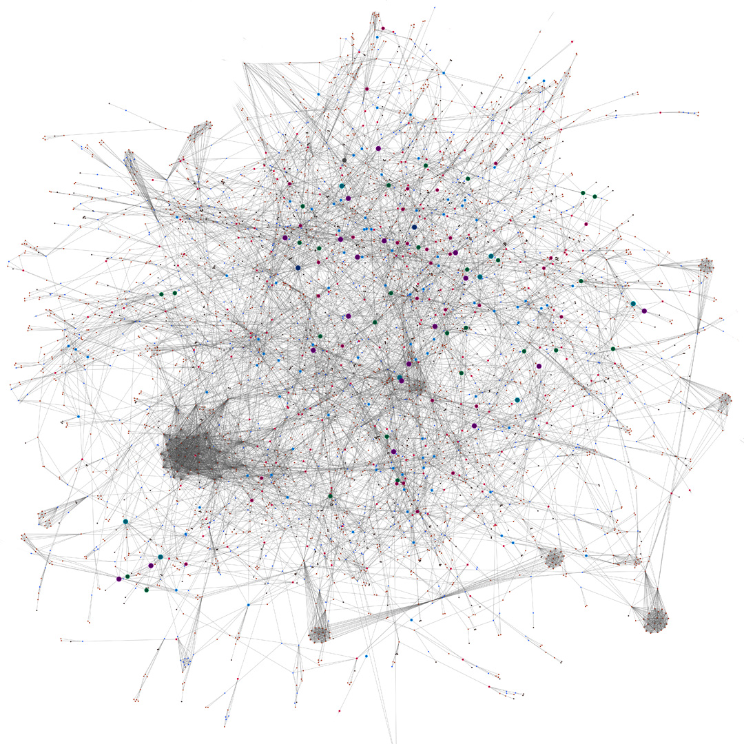
The goal: reveal clusters, patterns, and anomalies that are hidden in raw data.
The aesthetics of a network visualization are essential for the information in the network to be comprehensible. A well organized visualization that fits the purpose will help you better find and understand the information and insights you need.
Using graph layouts to clarify structure
Layouts are how the nodes and edges are arranged in a network visualization. This is usually done using an algorithm that determines how nodes and edges are arranged and grouped together. For example, a force-directed layout positions nodes depending on the force that’s acting on them, with more connected and consequential nodes positioned towards the center of the visualization. Layouts can also minimize edge crossings, create symmetrical edges, etc.
Some tools can also group similar edges together, which can help make large network visualizations more readable.
Adding interactivity to explore insights
Beyond simply presenting a static picture, modern network visualization tools also offer interactive features, enabling users to explore their networks dynamically: zooming in on areas of interest, filtering information, and even modeling the potential impact of changes within a network.
Network visualization comes with several advantages that can be a game-changer for teams working across industries.
The human brain processes visual information much faster than textual information. Visualizing a network makes it much faster to understand key information around relationships within a dataset, hierarchies of information, etc.
Exploring connected data within a visualization is much more intuitive than trying to sort through spreadsheets or tables. When understanding connections is important to the work you’re doing, visualizing is a fast and powerful way to analyze your data.
A network visualization tool can give you a dynamic way to visualize, explore, and understand your data. Playing around with how you represent your data lets you see both the big picture at a glance, and dive into granular detail. This flexibility enables you to gain key insights faster and more effortlessly.
The saying “a picture is worth a thousand words” is certainly true when it comes to network visualization. An image is a more impactful way to share key findings and information with decision-makers and other stakeholders.
The applications for network visualization are vast and varied. Any industry that uses connected data can benefit from this technology for better, faster decision making.
Network visualization lets you get an overview of IT infrastructure including servers, routers, workstations, and more. This lets you not only better understand dependencies in your network, but also helps more easily identify and remedy important health and performance issues.
Data governance is necessary to guarantee the quality, usability, and security of your data, and for larger organizations it’s a key conformity requirement. A network visualization tool gives business users the ability to visualize and analyze their operations and easily find answers.
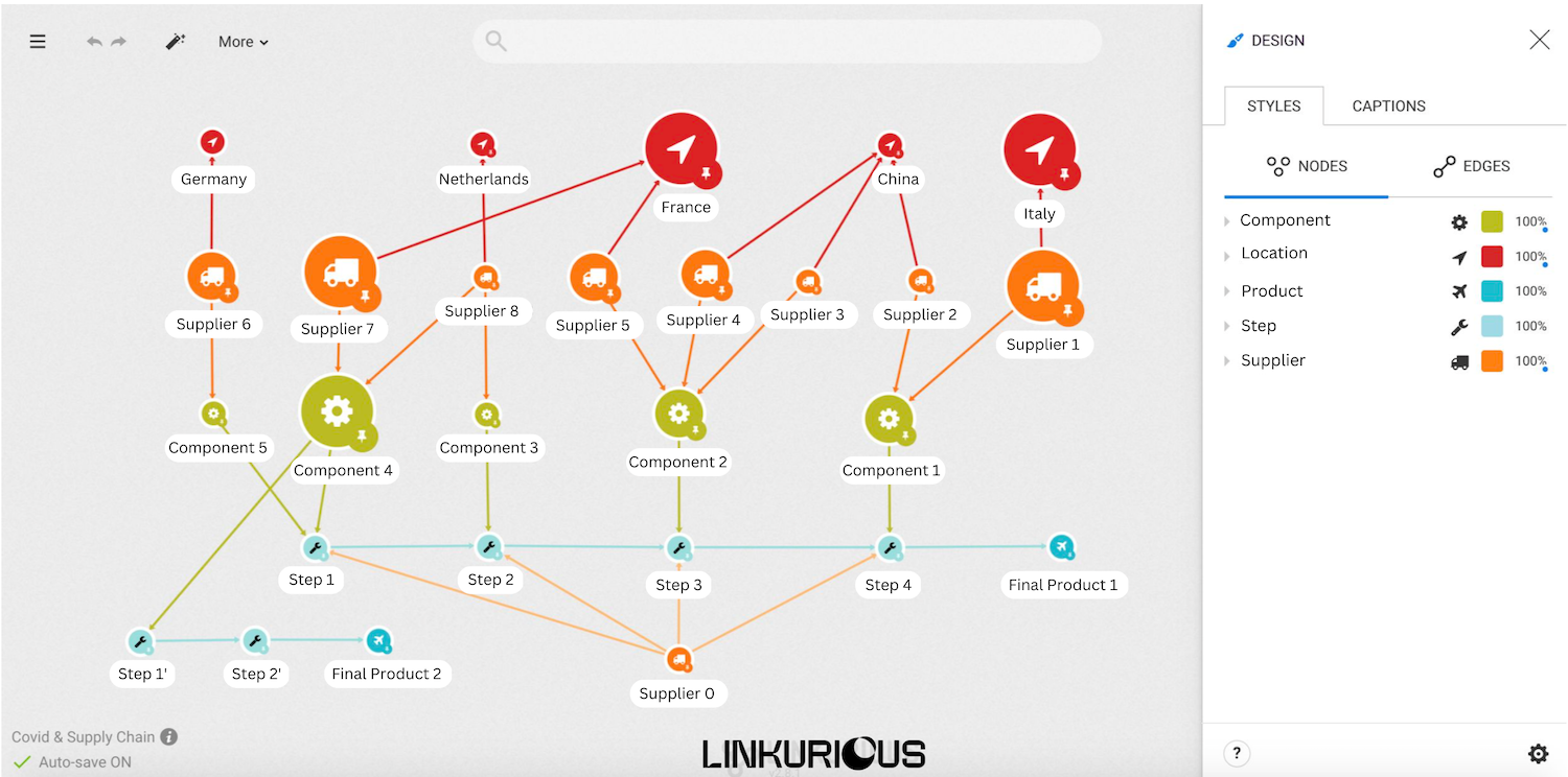
Today’s supply chains are highly complex, requiring the right tools and techniques to efficiently manage them. Network visualization helps analysts bring together key information to provide end-to-end visibility of supply chain operations. This enables analysts to more easily identify bottlenecks, track shipments, monitor supplier performance, etc.
With network visualization, you can display the data collected from servers, routers, and application logs and network status all in one place, and then identify suspicious patterns at a glance. Being able to visually explore connections makes it easier and more time efficient to identify compromised elements.
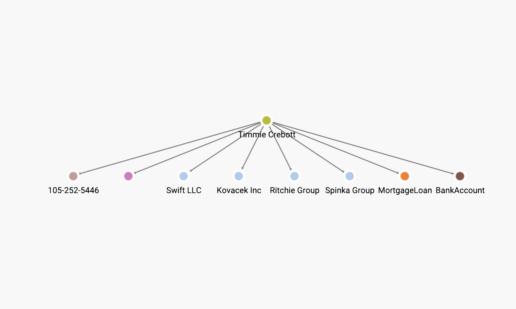
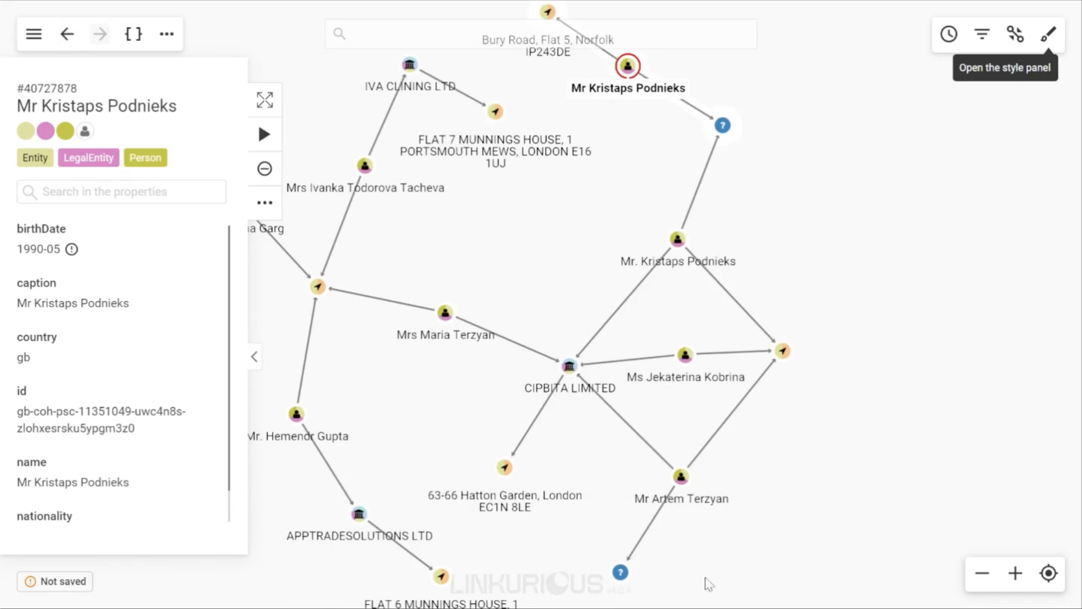
Using network visualization, intelligence analysts can quickly see and explore connections between people, emails, transactions, phone records, and more. This significantly accelerates investigations and makes it easier to spot suspicious activity within even large amounts of data.
AML and fraud analysts depend on many types of data to identify suspicious activity. For any given case they may need to look at customer information, claims details, financial records, or lists of politically exposed persons (PEPs) or sanctioned individuals or organizations. Network visualization is an efficient way to detect suspicious connections or patterns within heterogeneous data. It’s also an intuitive way to investigate fraud rings and criminal networks.
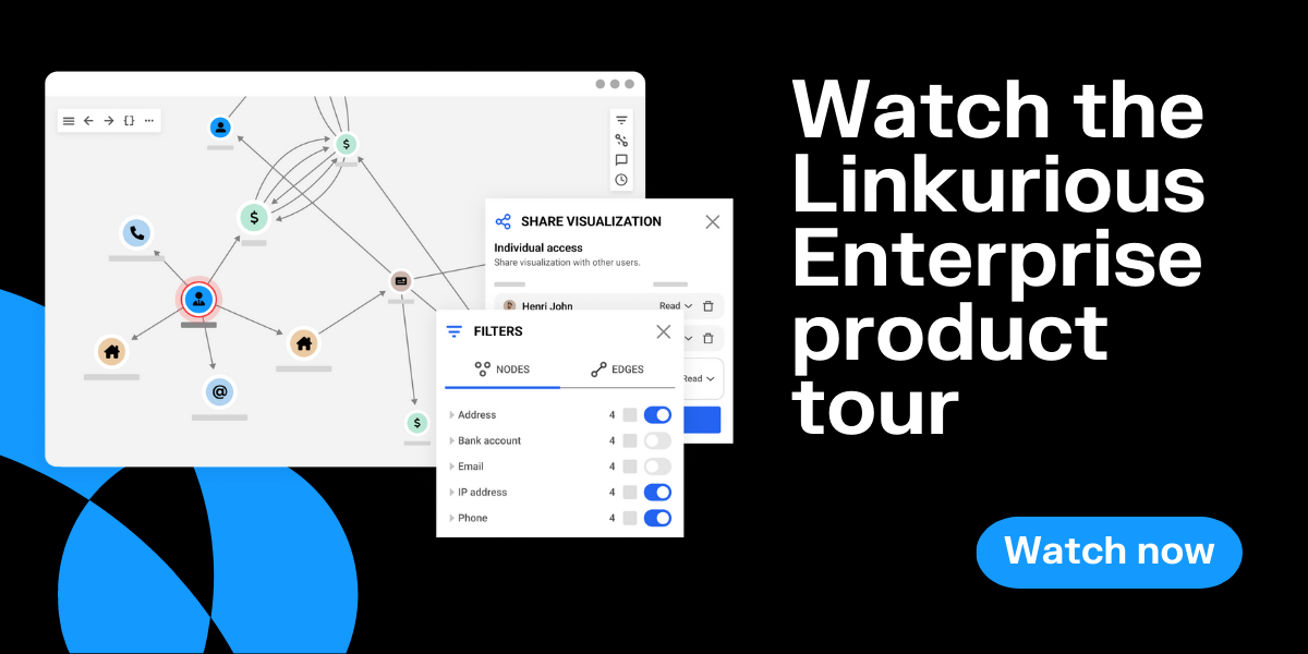
Linkurious is a software company providing technical and non technical users alike with the next generation of detection and investigation solutions powered by graph technology. Simply powerful and powerfully simple, Linkurious Enterprise helps more than 3000 data-driven analysts or investigators globally in Global 2000 companies, governmental agencies, and non-profit organizations to swiftly and accurately find insights otherwise hidden in complex connected data so they can make more informed decisions, faster.
FAQ Network visualization
How to visualize network connections?
What are the benefits of network visualization?
What software is used for network visualization?