Temporal data can provide critical insights for an investigation, but only if you have the appropriate tool to leverage it. In this article, we show you how time filtering works in Linkurious Enterprise and three methods to use temporal filters to find insights.
Have you ever had a large graph dataset but only needed to investigate data within a specific time-frame? Or had to understand how connected events were distributed over a period of time? Or needed to know the sequentiality of a group of similar nodes? If yes, the time-filtering capability of Linkurious Enterprise is made for you.
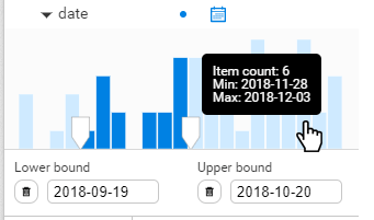
Date filters in Linkurious Enterprise allow you to filter graph data with date properties. Those date properties are displayed in histograms in which you can select time periods using a slider. This way, you get to take advantage of temporality during your investigation to:
- filter out irrelevant periods,
- get a better understanding of a sequence of events,
- all while getting extra information about how data is distributed over time.
Data from relevant time periods is accessible in a click
It may happen that not all the data available is needed to conduct an investigation. Maybe you were asked to check a person’s file additions over the past month. Or maybe you need to investigate punctual transactional information to fill a Suspicious Activity Report. With the time-filter capability, you specify a precise time frame in a click to focus on the relevant data. It reduces automatically the noise that large datasets can generate.
Overviews of the global trends help highlight anomalies
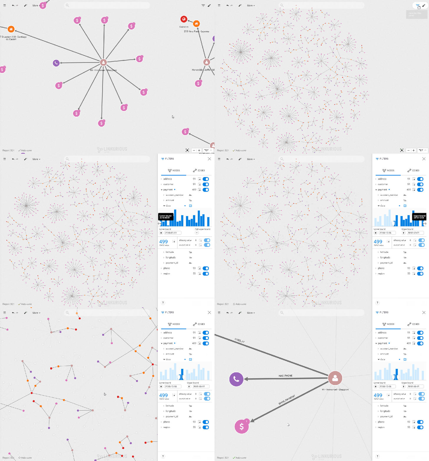
The graph approach is the best fit when you need to highlight connections but it lacks depth when it comes to understanding the distribution of numerical values. The way time-filtering works in Linkurious Enterprise has the added benefit of providing an overview of the distribution of values on a property. This is very useful for instance in situations where a peak of activity is suspicious. When monitoring people you easily identify, for instance, the day with the highest phone activity and inspect who has been in touch with whom, to assess a potential anomaly.
Recreate sequences of events to draw conclusions
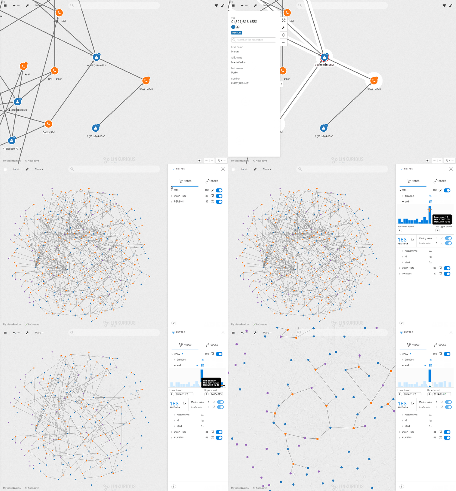
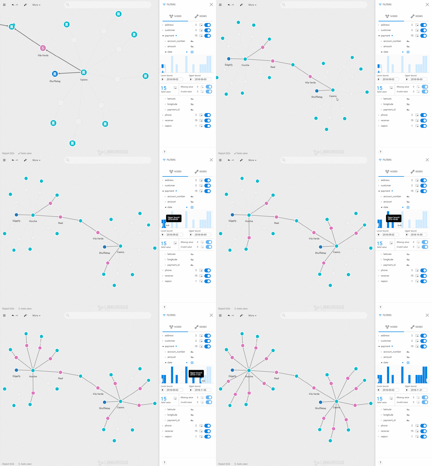
Temporality is also important in situations where data has a sequential link, a chronology. You might want to understand how money flew between organizations, or trace the chronology of criminal events. With the new filter, you can manually reproduce a timeline of events as data is filtered out of the screen, or added, in real-time when you drag the cursors on the histogram. Move the filter bounds to understand how nodes and connections evolve through time and stop to investigate a snapshot of the events.
- Check technical requirements
Make sure your temporal property values are stored as numerical timestamps in standard Unix Time (in seconds) in the database.
If you have a Neo4j graph database, you can use an APOC function to convert your convert your date in timestamps. If you use a JanusGraph database, you can run the time conversion in the gremlin console by iterating through the whole graph and using the appropriate Java library.
If your data is CSV file, you can use Excel conversion functions or python libraries unicodecsv and datetime to perform time conversions quickly.
And make sure that you are using version 2.6 or above of Linkurious Enterprise. You can check the version by clicking on “about” in the main menu under your username.
- Make sure the default filter type is correct
Open a visualization with nodes that have temporal properties and open the filter panel. A calendar icon should be visible next to the property name. If you see 123 or abc icon, it means it was categorized as a numerical or text property. Simply click on the icon to change it.
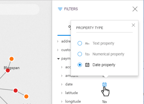
- Set filters
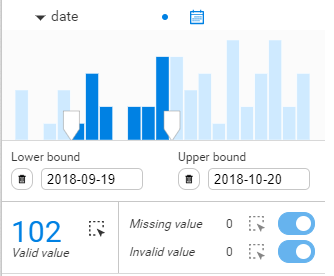
Once the correct filter type is set, you see a histogram with the values of the property you selected distributed chronologically. To set the filter on a specific range of values, type in lower and upper bounds, or drag the cursor directly in the bar chart. The nodes with a property value outside of this range will be filtered out of your visualization. The number of nodes with that property is indicated below the chart. You can select them all by clicking on the dotted-rectangle icon. On the right, you can see the number of missing and invalid values. The same dotted-line rectangle and toggle button let you select or filter them.
A spotlight on graph technology directly in your inbox.
