We all know organization charts do not reflect how companies work. Box, the cloud storage and collaboration company, has found a way to build a more accurate pictures. Their research show how companies across various industries work.
Box stores files and manage how users share and work on them. They have 25 million users at 225,000 businesses interacting with content 2.5 billion times quarterly. That gives Box a unique vantage point on the way companies actually work.
What do you do when you are a startup with access to high quality data and a passion to foster collaboration? You set to analyse the data and see if it has a story to tell. That is exactly what the guys at Box did. In a recently published Information Economy Report, they explained how they approached studying the way modern companies operate. With the authorization of a few customers, they collected data. Their focus was the flow of information within each organizations.
How to represent it? Not with an organizational chart but with a network or graph. The graphs Box built are made of nodes that represent individuals. These individuals are either employees of an organization or external collaborators. The nodes in the graphs are linked together. Every time someone has transferred a file to someone else, they have a link.
This approach is interesting for two reasons :
- it is data-oriented : it captures actual data from real businesses ;
- it reflects the way people work : sharing a document with someone means that you are working together (although “working” can mean a wide range of things)
The result reflects a truth about companies (and human organizations) : they are social networks. A company is a set of people working together to achieve common goals. How they share information and collaborate affect the ability of the organization to achieve its goal.
« "We’re entering an era where a company’s competitiveness is determined by its return on information – how democratized its access is, how fast it moves, and how quickly it can be updated and leveraged to generate value." »
Of course each company has its on way to share and collaborate. And the Box study shows 5 examples from different industries.
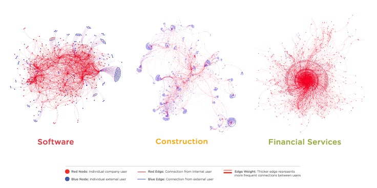
Box has created collaboration graphs that depict how people in a given company share documents (and work together). Their research shows there are patterns in the collaboration graphs. To highlight this they have chosen three companies from distinct industries : software, financial services and construction.

These three companies have the same size but offer very distinct pictures :
- the construction company looks like a jellyfish : small networks weakly linked together (the small networks actually match actual construction sites) ;
- the software company is one big hairball : within the company people are highly connected ;
- the financial services company has a clear center : we can see a group of nodes at the center around which the organization is spread ;
Simply visualizing the data tells us a lot about the different corporate culture of these companies. In addition to visualization, the graph data can be analysed using common SNA techniques.
For example, the Box team has looked at the degree of decentralization in the various companies and industries they surveyed. To evaluate the decentralization, they “measured the percentage of information distributors within companies”. In highly hierarchical organizations (like the financial services company) a limited number of people distribute the content. They serve as gatekeepers for the flow of information. In more open organizations, the content distribution can be initiated from a much larger part of the company.

We can see that the construction and entertainment industries are highly decentralized. Manufacturing or financial services are on the contrary quite centralized.
When CEOs and HR departments talk about “fostering collaboration” or “encouraging information sharing” it can sound a bit empty. The Box study shows that beyond the words companies can have very different ways to collaborate. It is not so surprising of course. Data does make the conversation more tangible. It would be interesting to see how the companies in the study will evolve. Will they be able to use the data to encourage the information spreaders? Will they be able to identify the bottlenecks or the under-connected elements? Is it possible to assess how well different departments work together?
Graph technologies can share an interesting light on something mysterious even for CXOs : how a company actually work. Document sharing, mails or meetings data could be used in a data-driven approach to promote collaboration. That would turn HR departments in network doctors?
A spotlight on graph technology directly in your inbox.

