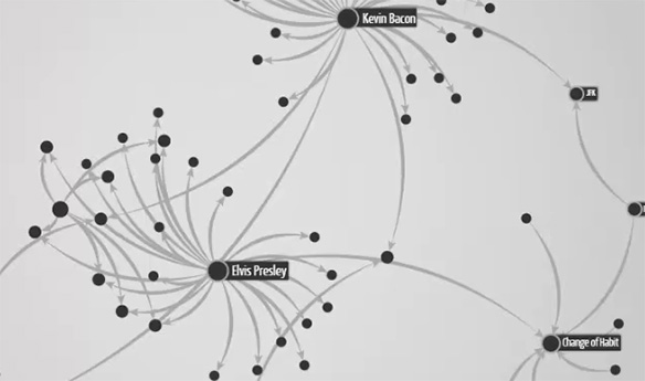
We are launching a series of posts to teach the basics of graph visualization, written by Sébastien Heymann in collaboration with Bénédicte Le Grand of Université de Paris 1. At Linkurious we are working on better software to help people visualize graphs easily. Of course writing software is a powerful way to improve our ability to tackle complexity but it’s no substitute for human intelligence. With that in mind we are starting a series of posts that will teach you how to create, read, and interpret graphs visually. Taking their roots in the Königsberg Bridge Problem, graphs are meant to be seen.

We have noticed in the recent years a tremendous adoption of graphs outside the scientific community, notably thanks to open source products like Neo4j and Gephi. Graphs offer a powerful tool to think, to design and to create new products adapted to our complex world.
However like any new tool we need to learn how to use it properly, and mastering the art of graph visualization and interpretation takes time. I am still horrified when I hear that graph visualization is “just a toy” or a “nice-to-have”. Quite the opposite, when visualization is correctly and wisely used, it becomes a very efficient medium between you and your data, between your point of view and the ones of your team, between your insights and your audience. Think about it as a surface that you can shape in many ways: layouts, colors, sizes, shapes of nodes and relationships, etc.
Such freedom is necessary to experiment, but it also comes inevitably with bad visualizations and fanciful interpretations. They are rarely deliberate thought, and during my other activities (as Gephi community manager and PhD student) I’ve seen many mistakes due to a lack of basic knowledge or skills. Beware also of histograms and “simpler” graphics: misleading charts are everywhere. I am personally attached to democratize network thinking, so at Linkurious we want to help raise the bar.
But there is a problem: where to start learning graph visualization? Whereas an extensive literature has been produced so far, one must compile various sources after hours of Web search, and try to extract what is important and what is not, what is meaningful and what is esoteric technique. I’ve read dozens of scientific articles and a few books, I’ve closely looked at what people do with Gephi, but I’ve not found a complete yet simple introduction to the visual exploration of graphs (aka networks), even if one can find good introductions to Social Network Analysis. So I’ve created a live tutorial two years ago for the ICWSM conference, and recently worked on a book chapter. It was two great experiences, but the audiences remain limited.
So today I’m excited to announce that we will start Graph Viz 101, a series of 10 blog posts about the theories related to visual graph exploration, in a concise, accessible style. It will help you understand our approach with Linkurious, but more importantly it will give you an in-depth perspective of the classical methods and challenges in the field. It will eventually help you formulate your needs, distinguish good vs bad visualizations, and avoid some common mistakes. Here is the plan (which may be modified later):
- Why Exploratory Network Analysis?
- Perceptual support of visualization
- Emergence of knowledge through visualization
- Visual representation of graphs
- A visual language of node-link diagrams
- The non-linear data processing chain
- Interaction and data mining algorithms
- Challenges: time-varying graphs and large graphs
- The global approach
- The local approach (where Linkurious stands)
Should you read our Graph Viz 101? The answer is YES, because I am sure that you will discover something new whatever your skills, unless (maybe) if you are already publishing research articles in this field. You will not find this content anywhere else thought: graph visualization is at the crossing of many fields of research, and I have literally spend months curating existing papers to assemble what I consider to be the most important approaches in these fields (e.g. infovis, psychology, design, data mining, and even a bit of epistemology). This presentation is original as it results from my experience and point of view, so I hope you will enjoy it and discuss it using the blog comments. I would love to see complementary discussions that help go deeper.
As a small gift before we start, don’t miss out the Subtleties / of / Color, 3 well-written blog posts by Robert Simmon that introduces color theory for data visualization.
A spotlight on graph technology directly in your inbox.