You might have heard that the competition between Lyft and Uber, the leading car-sharing services, is heating up. Accusations are flying and each party accuses the other of sabotage. Employees of each company would have ordered and cancelled thousands of rides. Both Uber and Lyft claim to have data to back up their allegations. Of course, at Linkurious we have no insights on the situation outside of what has been published. We do love stories that include deception and data though : we thought it would be fun to use the Lyft vs Uber case to illustrate how to use graph visualization to identify suspicious patterns.
The various outlets which have covered the car-sharing dispute allege the same thing :
- employees from Lyft/Uber have ordered rides from their competitors ;
- at the last minute they cancelled the rides ;
This tactic frustrates drivers who lose time (and thus money) chasing phantom customers. It also deprive real customers from accessing potential drivers. It sounds like a good way for not-so-honest people to disrupt a competitor!
Lyft claims to have spotted the tactic by investigating its data. Analysts at Lyft :
« Cross-referenced the phone numbers associated with known Uber recruiters with those attached to accounts that have canceled rides. They found, all told, 5,560 phantom requests since October 3, 2013. »
In other words, Lyft looked at the cancellations and found some intriguing links between them. Lyft alleges that some cancellations were linked to the same accounts, these accounts were linked in turn to the same phone number…and these phone numbers could be traced back to Uber’s employees.
A few of these employees would have acted with a lot of enthusiasm :
« One Lyft passenger, identified by seven different Lyft drivers as an Uber recruiter, canceled 300 rides from May 26 to June 10. That user’s phone number was tied to 21 other accounts, for a total of 1,524 canceled rides. Another Uber recruiter created 14 different accounts responsible for 680 cancellations. A single account from a Los Angeles-based Uber representative canceled 49 rides from October through mid-April. »
How long did it take Lyft or Uber to find about these attacks? Would they have found them if the attack had been executed more discreetly? According to Vallywag, Uber completed more than 800 000 rides per day in late 2013. Finding suspicious patterns in a high volume of data can be challenging.
I have prepared a small dataset based on the information Lyft and Uber would have used to identify the “DDoS” attacks. The data contains some 30 rides (canceled or not canceled) with the corresponding accounts, phone numbers…and IP addresses. Each order is linked to an account, accounts are linked to one phone number and one IP address. The articles on Lyft and Uber have not mentioned the IPs being used to detect suspicious activities but both companies could have used it.
The entire dataset has been loaded into Neo4j and can be downloaded here. Neo4j is a graph database and can be used to quickly find the connections between various entities, even in large datasets.
I have pulled up this data in Linkurious, the graph visualization tool we develop to understand what the people at Uber of Lyft may have experienced. In light green are IP addresses, in dark green phone numbers, in orange orders (with their dates displayed). The names represent the accounts.
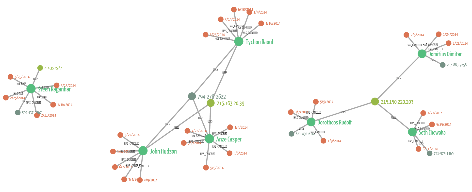
What does this picture tell us? We can see 3 separate groups of nodes and edges. When investigating a large dataset identifying patterns is key. In a typical fraud project for example, the data scientists explore the data to find fraud patterns. The data scientist wants to know what is a “normal” pattern and what is a “fraud” pattern. They then write code that can identify them automatically. In the end, the code identifies potential fraud cases. These results are investigated by a human being. He has to look at the data and decide whether it looks suspicious or not.
This process can be done by looking at tables, distributions, histograms but graph visualization is usually what works best for the human brain. After all fraud is always about deception and hiding links.
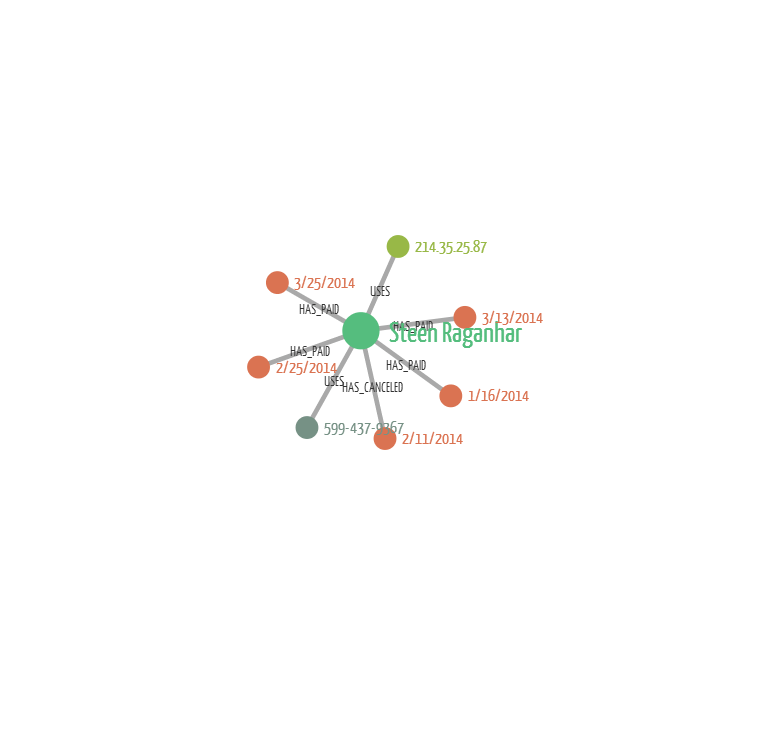
Here we are looking at an average customer. He has one IP address, one phone number and multiple orders. Only one of them has been cancelled. This is the “normal” situation against which we can compare suspicious cases.
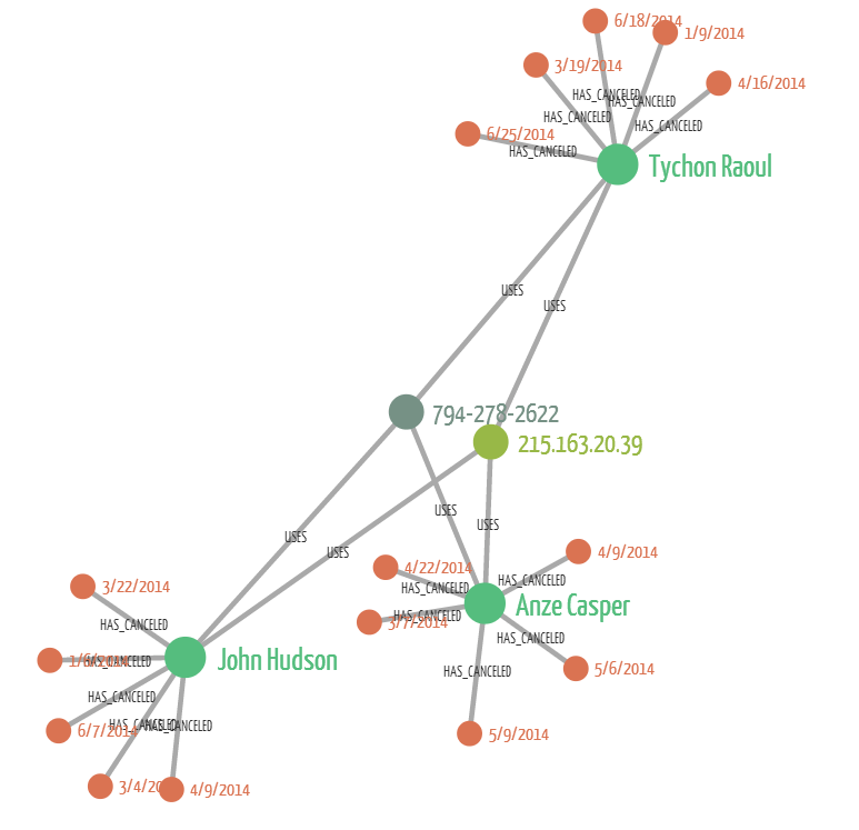
Here we are visualizing the kind of pattern described by Lyft and Uber. We have one IP address and one phone number. They have been used in combination to create multiple accounts and each of these accounts has canceled 5 rides. We can see that it looks very different from the “normal” customer.
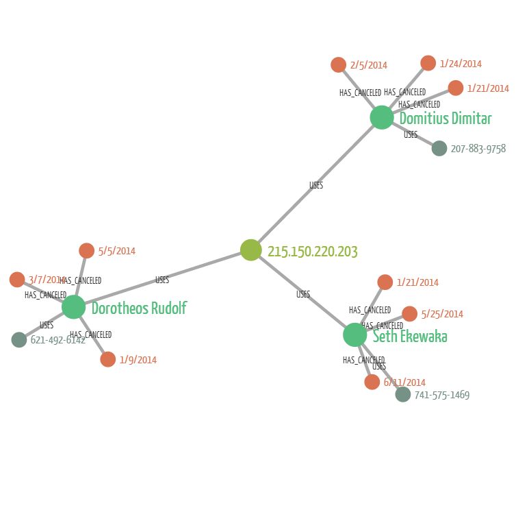
In this last case, there i still one single IP address but now for each account there is a distinct phone number. If we were only using the phone numbers, we’d miss the connections between Domitrius Dimiatr, Dorotheos Rudolf and Seth Ekewaka. The IP address tie them together and we can see that a single device is used to cancel multiple car rides.
Based on his quick data visualization analysis we could :
- use our data to look for people who have created numerous accounts tied to one phone number and/or one IP address ;
- look at more canceled rides and see whether the resemble the suspicious patterns or to the “normal” pattern ;
Graph visualization helps quickly identify patterns in data. If you are looking for hidden connections in a large dataset, graphs and graph visualization can help you get results faster!
A spotlight on graph technology directly in your inbox.

