Remember a few months back when we rolled out a super fast GPU layout? Well, reader, we’ve done it again. In this latest Ogma release, we’ve continued our efforts to make the force layout even faster to bring you even better user experience and fluidity. Trust us, you’ll want to see this.
In parallel, we’ve also continued to improve the look and feel of Ogma. Now we are offering fully rounded corners (very trendy these days!), hover on badges, better badge text alignment and more. Read on to get the details on what’s new in Ogma 4.6.
We are proud to announce that our GPU layout is now 4x faster than the CPU version, and 3x faster than the previous GPU layout. As a reminder, GPU means that it utilizes the processing power of graphic cards to perform the computationally intensive tasks required to calculate the layout. The advantage of this approach is that the graphics card can process large amounts of data in parallel, thus making the algorithm more performant. See it in action here.
In addition, we improved the overlap removal pass with this release. The GPU layout is therefore not only faster, but also displays more symmetry and better shape.
Even more exciting than this faster, smoother layout is what’s coming down the pipe. We’re gearing up to break some records in layout speed - so stay tuned, and hold onto your hats.
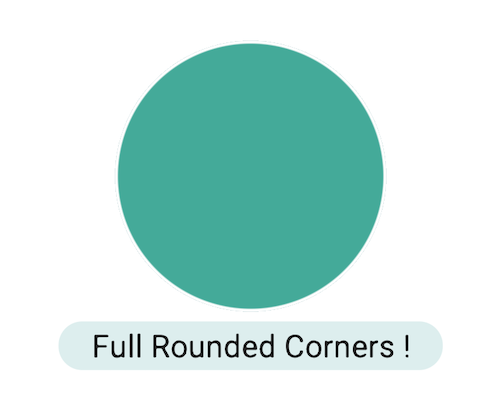
We’re always working to provide more - and better - options for your visualizations. Ogma already provided rounded corners on texts, but they were limited in height, producing only rectangles with rounded corners. Now, you can use a capsule shape for your text, giving you even more flexibility.
Previously, groups stole the focus away from edges. On hover, the entire group was highlighted, but not the edges within. Now, that’s changed. You can create richer behaviors with open groups, like highlighting individual edges on hover.
When using Geo Mode, sometimes multiple nodes fall on the same or very close coordinates. We released an example on how to show multiple nodes in Geo Mode when this is the case. It involves synchronizing two instances of Ogma to expand those nodes. Once expanded in the overlaid second instance of Ogma, you can interact with the nodes, expand them, and more. This brings a new level of insight to your data!
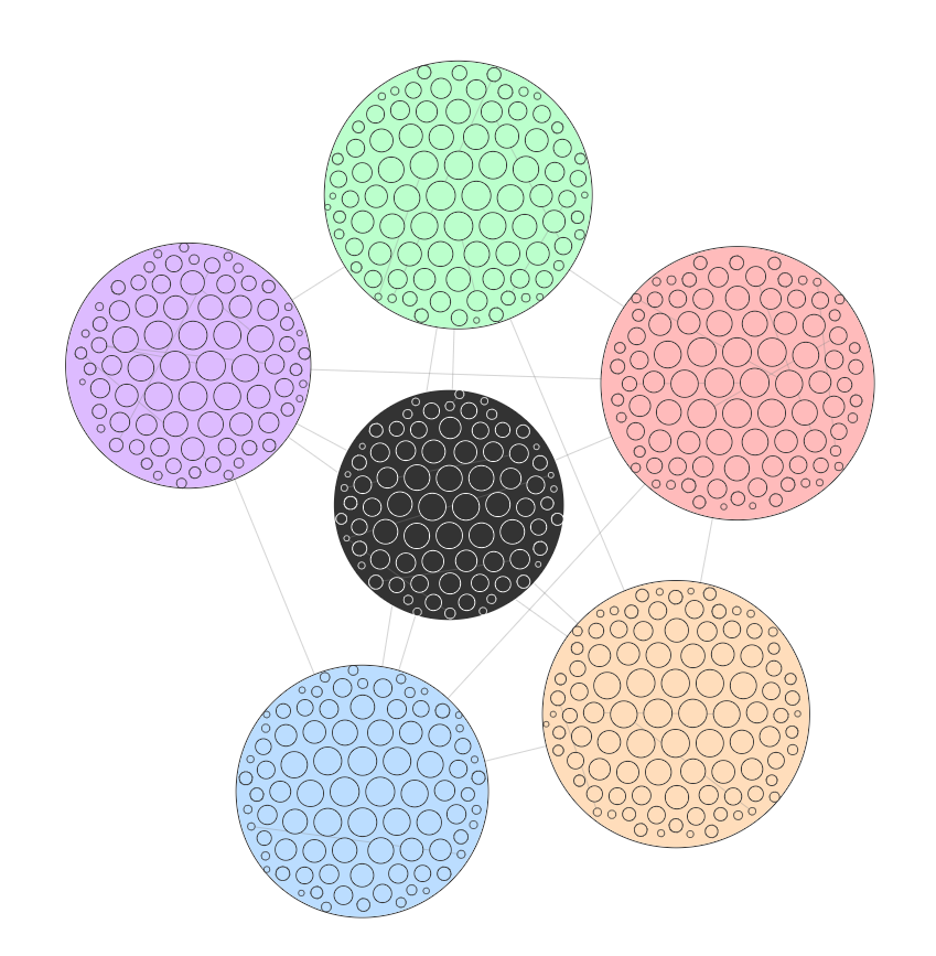
Ogma is bringing you a simple new way to arrange non-connected nodes together: circle packing! This newly available layout ensures compactness while putting emphasis on big nodes by placing them on the center.
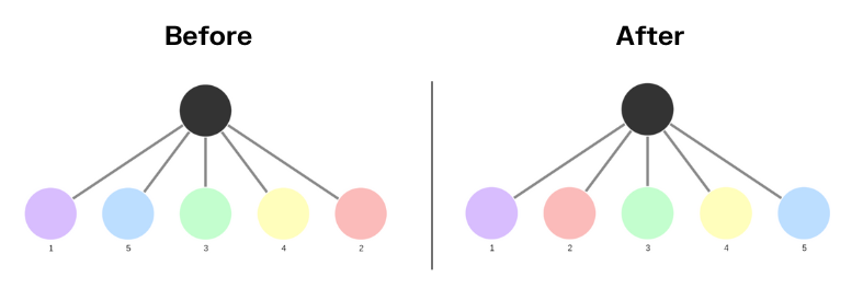
In the hierarchical layout, it was already possible to decide which nodes are on top of the hierarchy and which are at the very bottom. We have added a new option to sort nodes from left to right, so that the graph can be read just like a book: top-down, left-right. It makes it much easier for users to quickly find which nodes are important among siblings.
A spotlight on graph technology directly in your inbox.
