Graph data visualization for cybersecurity: How to assess cybersecurity vulnerabilities
Cybersecurity teams are working in increasingly adverse environments, as cyber threat actors have grown more sophisticated, and the introduction of AI has lowered the bar to entry into the cybercrime space. The average cost of a data breach has grown to $4.4 million in 2025. And 72% of companies report that cyberattacks have increased year-over-year.
The biggest challenge goes beyond just more threats; it’s too much disconnected data. Security teams must piece together fragmented telemetry from endpoints, networks, identities, and cloud workloads. The result is an incomplete understanding of an organization’s risk exposure, where critical relationships and major threats remain invisible while security teams waste time on lesser threats.
Graph visualization and analytics are changing the equation. By letting cybersecurity teams model the IT environment, graph technology makes it possible to understand how assets, users, and vulnerabilities are connected—and where attackers could move next. We’ll take a brief look at how graph technology can be applied to cybersecurity, before taking a close look at how to evaluate vulnerabilities using a vulnerability graph.
Graphs are a way to visualize systems and relationships. They can be used for a variety of different purposes, including representing the various components of an organization’s IT environment to be able to quickly model vulnerabilities or potential attack paths. This includes a variety of different entities, such as computers, users, applications, data, security controls, and more.
Graphs are particularly well suited to modeling IT systems, which inherently contain many interconnected entities. The key elements of a cybersecurity graph include:
- Nodes: The nodes represent the various entities that make up an organization’s network. This includes systems, users, applications, data, and every other part of the organization’s IT environment and infrastructure.
- Edges: Edges encode the relationships between the various nodes within the cybersecurity graph. For example, the fact that a particular user account can use an application would create an edge between the user and that application.
- Properties: Properties can be applied to the various nodes and edges within the graph to offer additional information. For example, an edge between two systems might include information on firewall rules that specify the network protocols permitted to follow that edge.
Graph has many applications in cybersecurity. Graph analytics can be used to detect anomalous behavior in a network, such as unusual patterns of data access, data exfiltration, or lateral movement, helping flag suspicious activity and identify security threats.
Other common use cases for graph analytics in cybersecurity include:
- Vulnerability analysis and remediation
- Incident analysis and response acceleration
- Threat hunting and adversary mapping
- Security control development and testing
Read our white paper to take a deeper look at how graph analytics are helping cybersecurity teams investigate and mitigate risk at scale.
Layering graph visualization on top of existing technology can further empower security analysts. Visualization considerably reduces the scale and complexity of security analysis. And, visualizing complex networks makes cyber security threats easier to understand and explain, which can empower analysts to react to threats more quickly.
Let’s take a look at how a graph analytics and visualization solution like Linkurious Enterprise performs for creating a vulnerability graph and mapping cyber attack paths.

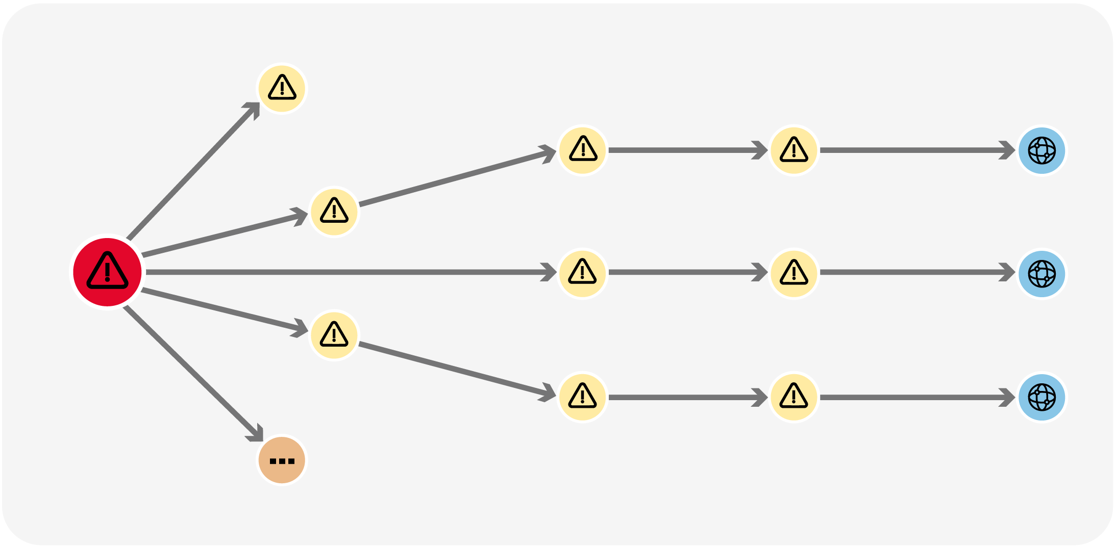
For many security teams, the biggest challenge is determining what is and isn’t important. Vulnerabilities and security events tied to sensitive data, critical systems, and important workflows are always a top priority.
However, it can be challenging for teams to identify these potential impacts. For example, a database server that supports several applications may play a critical role in the business, or a particular application or system could be a vital link within an important workflow.
Vulnerability graphs illustrate these relationships and can help tie potential threats to the real-world business impacts. In most cases, a cyberattack begins with a user workstation infected with malware, a compromised webpage, or leaked credentials. Vulnerability graphs show what an attacker can do with this access, tracing a potential path from their initial foothold to high-value business assets, such as sensitive data or mission-critical applications.
Consider the scenario where an employee’s computer is infected with malware that likely would steal their password and provide access to their account. Incident responders need to determine the scope of the security incident and the potential impacts on the business.
From a triage perspective, a good starting point is determining whether an attacker could access high-value assets via the compromised account so that access can be locked down. The graph below shows what this scenario would look like in a Linkurious graph.
On the other hand, here is an abnormal behaviour pattern. Most of the IPs that connect to “172.16.0.11”use port 25 (SMTP Port) and don’t generate any other traffic than that on any other services. This is suspicious in itself. But the large number of IP’s doing the same operation at the same time seem to indicate a botnet network carrying out a UDP storm attack. These attacks are basically a denial of service attack (DoS).
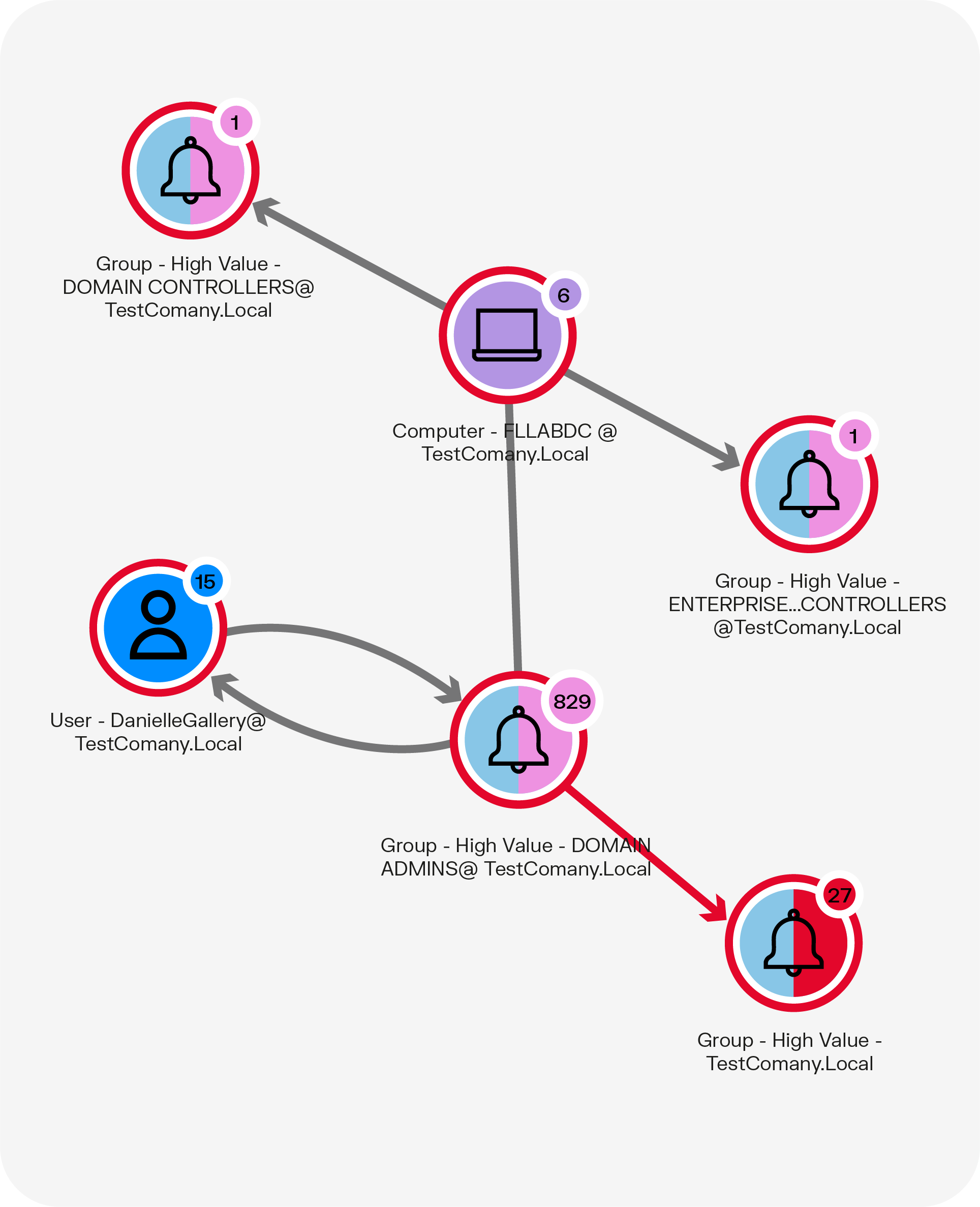
This graph shows that the user with the compromised account, Danielle Gallery, has administrator-level permissions in a high-value domain. Additionally, this access provides her with access to a particular computer with direct links to two other high-value groups.
After identifying assets that are at risk due to the compromised account, the next step would be to look for signs that the attacker has exploited this access. A graph can also be used to visualize connections to the computer shown in the graph above.
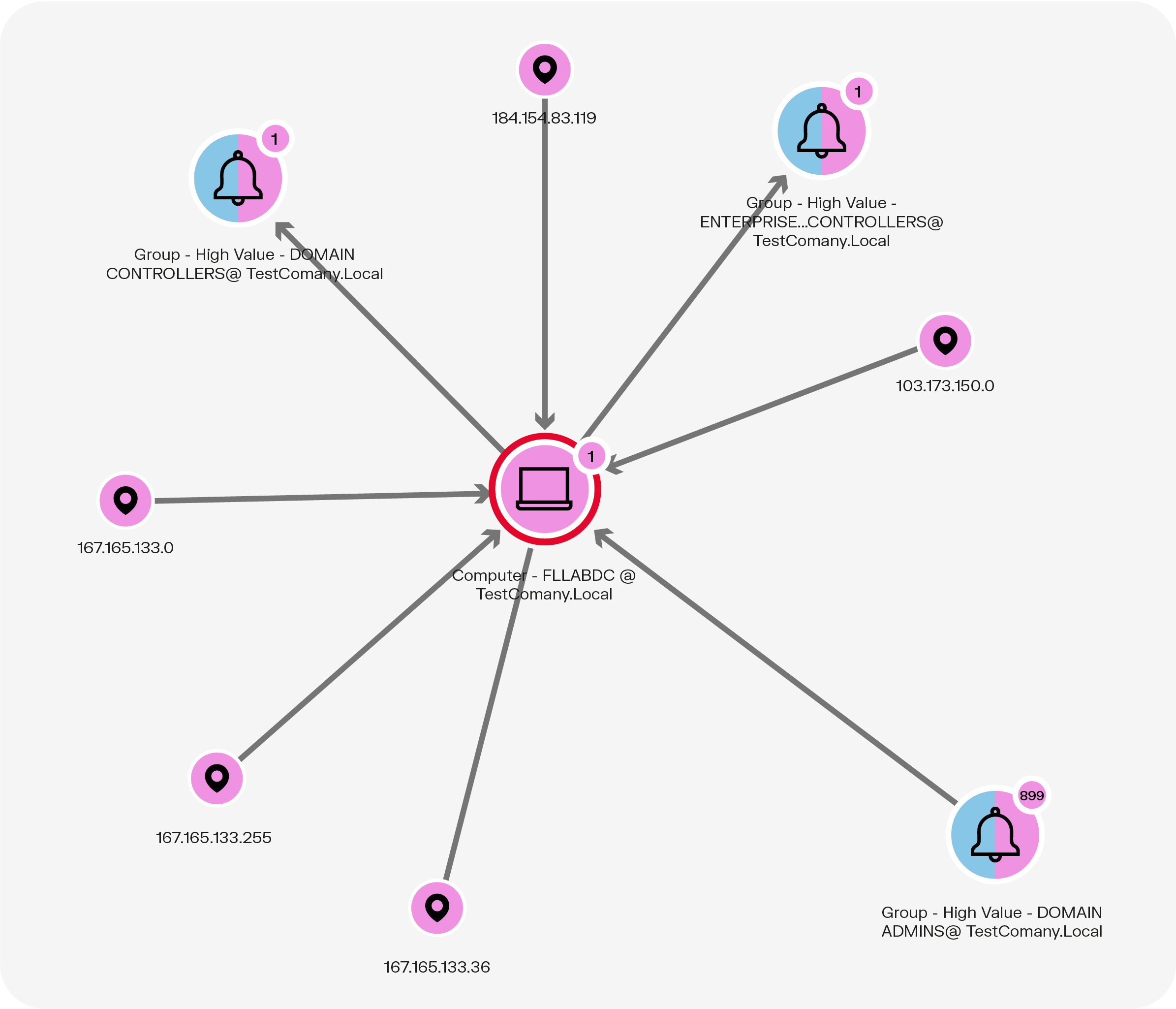
Using this graph, incident responders can identify potentially anomalous connections to the computer named FLLABDC. Analyzing IP addresses reveals that the majority are from the Chicago area, but the 103.173.150.0 address is from Panama, which is suspicious. From here, analysts can dig more deeply into connections involving this address to see whether it was likely associated with the malware infection or might have a benign explanation, such as an employee who is working while traveling.
The information presented in these graphs would be accessible within log files. However, being able to visualize the information in a graph can rapidly accelerate analysis, allowing the organization to potentially shut down the intrusion before significant damage is done.
This simple use case shows the great potential graph visualization technology has for cybersecurity vulnerability analysis. It helps analysts more easily make sense of their connected data and investigate any suspicious behaviors in their network. Graph visualization offers a fast and precise way for analysts to understand any kind of security event. Assessing the degree of sophistication of a vulnerability or security breach and reacting accordingly becomes easier than ever before.
Graph technology also enables the automation of a large part of the detection process, allowing analysts to focus more time and effort on investigating high-priority security alerts on the network. Collaboration features in a solution like Linkurious Enterprise also facilitate teamwork. Linkurious meets all security standards for sensitive data and provides all the necessary tools to administer user rights access.
Want to start exploring your graph data to gain deeper insights, faster? Discover Linkurious.
A spotlight on graph technology directly in your inbox.