A graph visualization tool helps you see the connections hidden in your data. It turns complex information into clear views that make relationships easy to understand. Whether you are investigating fraud, strengthening cybersecurity, or managing suppliers, visualization transforms raw data into insights you can act on.
Graph visualization platforms vary in focus and capability. Some are built for simplicity, others for collaboration or large-scale analysis. This guide walks through what these tools do, how they differ, and what to consider when choosing the right one for your organization.
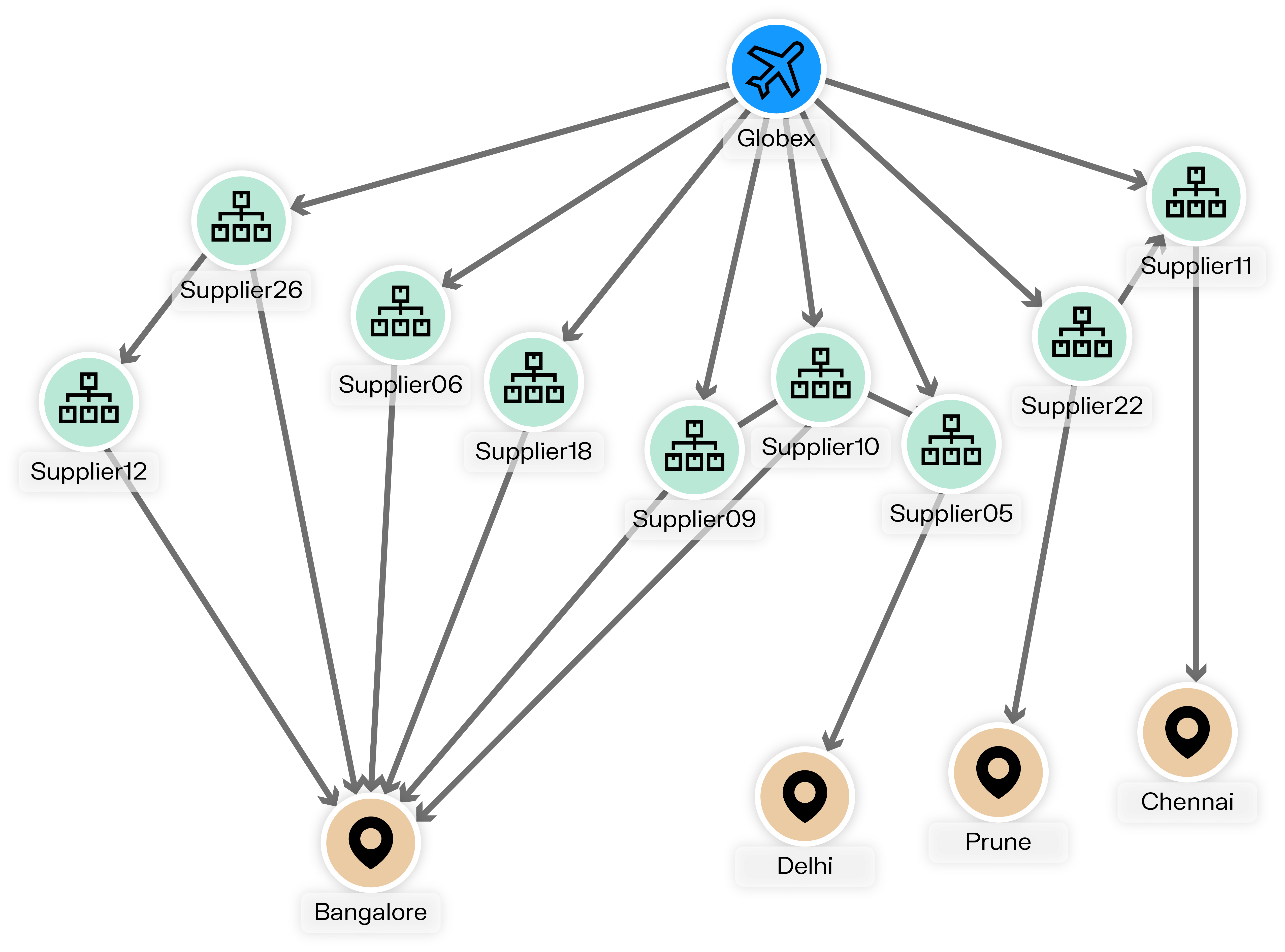
A graph visualization tool is software that displays entities and their relationships in a visual way. Entities can be people, accounts, devices, or other objects, while relationships show how they interact or connect. For example, a bank account might be linked to another account through a relationship labeled “transfers funds to.”

With a graph visualization platform, you can add meaning through labels, properties, and semantic relationships. This helps analysts or business users explore how data points connect and where patterns appear.
These tools are often used with graph databases such as Neo4j, Amazon Neptune, or Memgraph to make data exploration and analysis faster and more intuitive. In addition, modern platforms can bring together multiple data sources into a single, consistent view, automatically applying business rules or filters along the way. As a result, analysts can focus on finding insights rather than spending time on data preparation.
Working with graph data without visualization is like reading a book with no punctuation: the story exists, but it is difficult to understand. Visualization adds clarity.
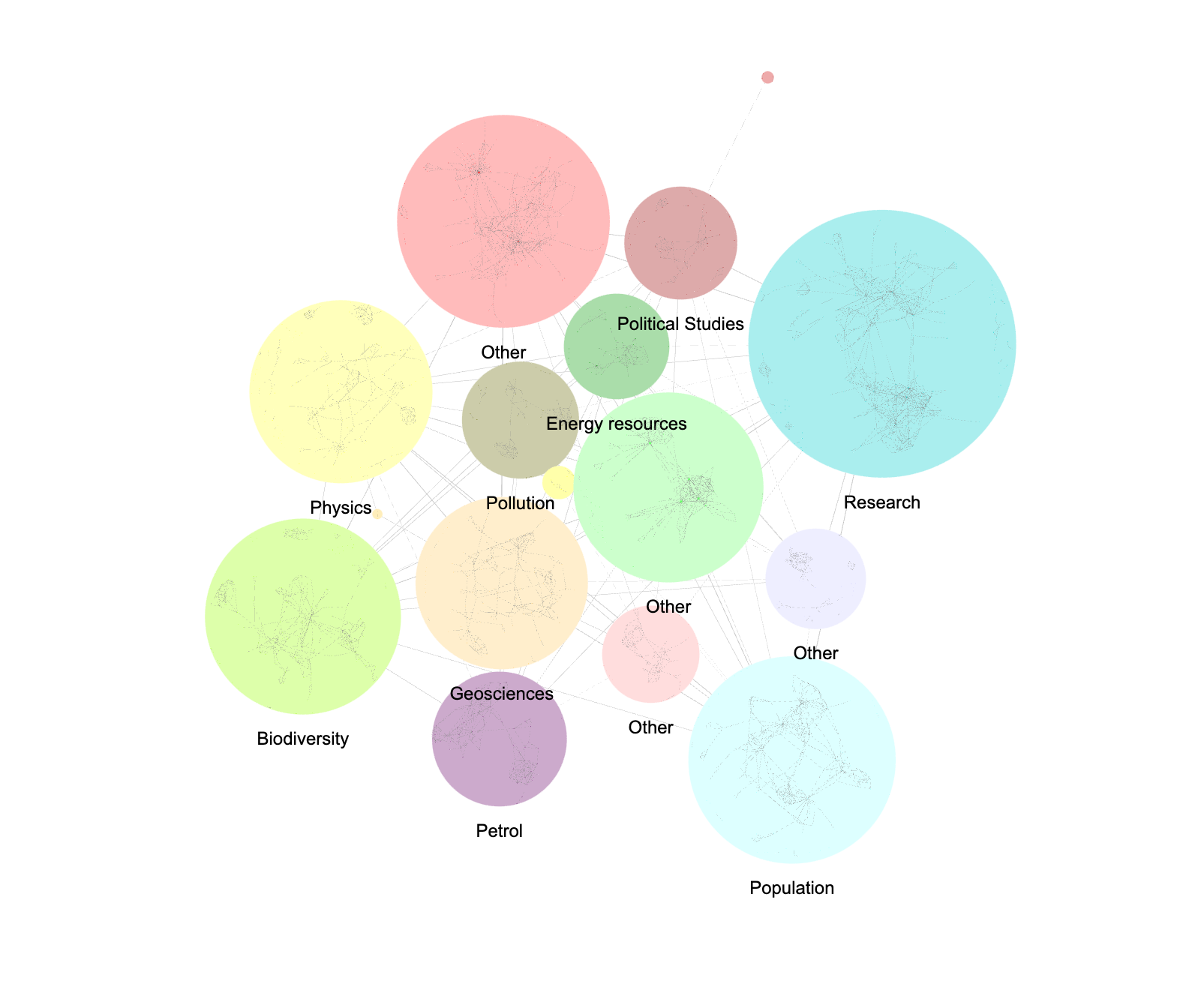
It surfaces relationships, communities, outliers, and links you would miss in a spreadsheet. It also enables interaction. You can zoom, filter, and highlight entities to focus on what matters most.
In domains like financial crime investigation, cybersecurity, or intelligence analysis, analysts rely on graph visualization to uncover how people, accounts, or events connect. Without it, part of the story may remain invisible—or take much more effort to surface.
And its value goes far beyond investigation: from marketing to research to operations, visualization helps anyone working with connected data make sense of complexity. When teams share the same view of their network and have the right context to interpret connections, it becomes easier to explain why a relationship matters and decide on the next steps together.
When deciding to adopt a graph visualization solution, one of the first choices is whether to build a custom application or adopt an existing platform.
Building your own application with a graph visualization library such as Ogma gives you higher control over the interface, features, and integrations. This can be valuable for organizations with specific requirements and internal development teams. However, custom development also requires considerable time, specialized expertise, ongoing maintenance, and adds risk to the project.
An off-the-shelf solution, on the other hand, offers a faster and easier path. It comes with ready-made features for visualization, search, and collaboration, allowing teams to focus on using the data rather than building the infrastructure. Some configuration is still needed, but deployment is generally quicker.
Here, we’re focusing on off-the-shelf platforms such as Linkurious Enterprise, which combines the flexibility of graph analytics with the convenience of a fully supported product.
Start by clarifying what you want the tool to achieve. Are you looking to explore graph data interactively, or to create visual dashboards for reporting?
- For investigation or data exploration, choose tools that focus on interactivity and ease of navigation.
- For reporting, pick solutions that connect easily with analytics or BI platforms.
Platform performance may change a lot depending on data volume. A tool that handles thousands of nodes may struggle with millions.
- Check rendering speed and stability with large datasets.
- Look for clustering and filtering options to reduce visual noise.
- Choose a platform with graph layouts that fit your data shape. For example, tree views for hierarchies, circular views for peer groups, and force based views for dense relationships.
The right tool depends on who will use it: a data scientist and a business user will approach visualization differently.
- If your team is non-technical, choose an interface that is easy to learn. Tools like Linkurious are designed with non-technical end users in mind.
- If your team includes analysts or investigators, look for platforms with full-text search, filtering and alerting features that make exploration and analysis easier and faster.
- Make sure the tool you use connects smoothly to your existing data sources and workflows.
- For larger organizations, pay attention to user management, role-based access control, fine-grained permissions, and audit trails, so work can be tracked and shared securely.
A visualization tool should fit easily into your existing workflow, so think about where your data lives and how you plan to use the visuals.
- Does it connect to your graph database directly?
- Can it combine multiple data sources?
- Can you export visuals, share interactive views, or integrate them into reports and casework?
Choosing a tool isn’t just about features, reliability and sustainability matter just as much.
- Review the licensing model and check if the features you need are included.
- Evaluate documentation, updates, and technical support.
- Consider deployment options (SaaS, on-prem), security reviews, and long term support.
- Plan for recovery and audit needs, including versioning for saved views, who changed what, and the ability to roll back mistakes.
Here are some of the most frequently referenced graph visualization tools in professional reviews and industry discussions.
Linkurious is a platform that brings graph visualization, analytics, and collaboration together in a single workspace. It connects to multiple graph databases and integrates features like AI-assisted alerts, case management, and entity resolution. Used by over 10,000 users in organizations across finance, cybersecurity, and intelligence, Linkurious enables teams to explore complex networks, share findings securely, and act on insights with clarity and speed.
Pros
- Web based, collaborative graph visualization built to be intuitive for both business and technical users.
- Database agnostic: compatible with Neo4j, Azure Cosmos DB, Amazon Neptune, Memgraph and Google Cloud Spanner.
- Includes enterprise features such as a no-code query builder, alerts, case management, visualization exports, entity resolution, and team collaboration.
- Automatically creates an interactive visualization of the graph structure, showing node labels, relationship types, and their counts.
Supports parameterized queries that can be saved and reused as reports. - GPU-accelerated rendering and layout for faster, smoother graph visualization.
- Available as a fully-managed service, or on-premises.
Cons
- May cost more than lightweight tools for single users or very small teams.
- Some features may require deployment and onboarding effort.
Gephi is a free, open-source desktop application for graph exploration and visualization. It is widely used in academia, journalism, and network science. Its interface makes it appealing for researchers, educators, and analysts working with individual datasets across fields such as social network analysis, SEO, and data journalism.
Pros
- Free, open source, and easy to install across platforms.
- Strong for exploratory analysis, workshops, and academic use.
- Produces visually striking layouts, even with large but not massive graphs.
- Supported by an active user community.
Cons
- Limited maintenance and prone to crashes due to infrequent releases.
- Desktop-only and not built for collaboration or multi-user environments.
- Performance slows with large graphs since everything loads in memory.
- No alerts, advanced queries, or integration with graph databases.
Cytoscape is a desktop application originally created for visualizing molecular interaction networks and biological pathways. Over time, it has been adopted in other research fields that require detailed network exploration and analysis. It offers a plugin-based ecosystem and a broad set of analysis and visualization functions for complex network data.
Pros
- Rich layout options and extensive styling controls for nodes, edges, and attributes.
- Advanced analytical features including clustering, network statistics, and integration with external data tables.
- Open source and extensible, with many community plugins to add domain-specific analysis or import/export options.
Cons
- Desktop-based and primarily geared toward individual researchers, rather than multi-user, browser-based collaboration.
- Optimized mainly for research and bioinformatics use cases; not designed as an end-to-end investigation or case-management environment.
Handling very large or highly interactive graphs can require additional tooling, especially compared to platforms focused on web-scale graph exploration.
G.V() is a client application for interactive visualization and exploration. It automatically scans the graph schema, showing node labels, relationship types, and counts, and lets users explore and edit graph data with an interactive interface. Features such as multiple query tabs, parameterized queries, and full-screen graph views are designed to support day-to-day work.
Pros
- Automatically generates an interactive view of the graph data model, including labels, relationship types, and counts.
- Supports multiple query tabs and parameterized queries, which can be saved and reused as reports.
- Offers multiple layout options.
Cons
- G.V() does not provide alerts, case management and other collaborative investigation features, so steps like tracking progress, managing cases or maintaining case histories must be handled outside the tool.
Graphistry is a visual graph analytics platform designed to help analysts and developers turn large, connected datasets into interactive visual investigations, often via Python, JavaScript, or other integrations. Its GPU-accelerated rendering and analytics make it suitable for security, fraud, and operations teams working with large event or relationship streams.
Pros
- Uses GPU acceleration to render and analyze large graphs interactively, improving responsiveness at scale.
- Provides tools and libraries for integrating visual graph analytics into data science and security workflows.
- Supports sharing and embedding visual investigations created from code or notebooks.
Cons
- Often accessed through developer-oriented tooling (for example, Python and JavaScript APIs), which may require technical skills to set up and maintain.
Focuses on visual analytics rather than providing a full case-management and alerting environment out of the box.
Tom Sawyer Explorations is a no-code, end-user graph intelligence application designed to help analysts rapidly explore connected data. The tool supports multiple graph databases and targets industries such as finance, healthcare, cybersecurity, and supply chain management.
Pros
- Provides a no-code query builder, allowing users to create graph pattern-matching queries through a visual interface and explore the results interactively.
- Supports popular graph engines including Neo4j, Amazon Neptune, JanusGraph, and OrientDB.
- Offers advanced layout styles, annotation features, and graph algorithms.
Cons
- As a specialized exploration tool, it does not include full enterprise investigation workflows by default (such as alerting or advanced case-management).
- Although designed for analysts, achieving full value often requires a more complex setup (database connectivity, schema integration, styling and pattern-matching configuration).
GraphXR by Kineviz is a browser-based graph visualization and analytics platform for exploring high-dimensional and connected data. It combines interactive graph views with capabilities such as spatial and temporal exploration, and is designed to help users understand how relationships and patterns evolve over time.
Pros
- Web-based environment for interactive exploration of large and complex graphs.
- Emphasizes time-based and evolving networks, helping users see how relationships change rather than only static states.
Cons
- Focused on graph exploration and analytics; investigation workflows and case handling need to be built around it or integrated from other systems.
Once you’ve shortlisted a few tools, test them with your own data. A short pilot will tell you more than any feature list. Still, here are some key aspects worth checking based on your specific use case:
Can you click, expand, and trace relationships without lag? Smooth navigation is essential when graphs grow.
Does the tool offer tree, circular, and force-based views to fit different types of networks?
These are what keep the graph readable as data volume increases. Try clustering or dynamic filters to reduce visual noise.
Colors, icons, labels, and grouping options make complex graphs understandable at a glance.
Look for seamless connections with your data sources and APIs, plus options to share dashboards or export visuals.
Can multiple users comment, tag, and manage permissions? Check also for role-based access and audit logs.
Does the tool let you set up notifications, track issues, or manage cases efficiently? Look for features that help your team respond quickly and keep workflows organized.
Evaluate the quality of documentation and how quickly customer support responds to inquiries. Consider how often the tool is updated and how long each version is maintained to ensure your team stays supported as the product evolves.
Check whether the tool gives you control over what users can view or modify. Role-based access rights help you restrict actions such as editing graphs or viewing sensitive nodes.
You may also want to verify:
- Whether roles can be assigned fine-grained permissions,
- If the tool can run on-prem or in a secure cloud setup,
- The presence of security certifications such as ISO 27001 or SOC 2,
- The availability of an audit trail,
- And support for your organization’s authentication systems (e.g., SSO, LDAP).
The best way to compare is to work hands-on: upload a sample dataset, explore, and see how quickly you reach real insight.
There is no universal solution for graph visualization. The right platform depends on your data, your workflows, and how your team plans to use the insights.
For organizations working with complex data, Linkurious helps transform connections into context. It adds an intuitive visual layer that makes patterns clear to both technical and non-technical users. Teams can investigate, collaborate, and respond to what they find in a single, secure environment.
Choosing a platform that integrates smoothly with your existing data sources and investigation processes can accelerate the path from discovery to decision. With its focus on clarity, collaboration, and scalability, Linkurious helps teams work faster and with greater confidence on what truly matters.
A spotlight on graph technology directly in your inbox.